The Curated Colonial
Let’s see how our client’s vast collection of art & antiques inspired their home’s makeover!
We can think of many reasons why someone would like to live in Newport, RI. It has so much to offer, from the beautiful beaches, to the amazing restaurants and of course, the charming homes! Our client’s came to us, looking to makeover a few rooms in their colonial style home built in the 1750’s. They have such an appreciation for the home’s history & architecture so, it was very important that the interior felt just as special. The client’s enjoy displaying art & antiques so, we saw this passion as an opportunity to use their existing collection as inspiration for the new color schemes, patterns, textures and furniture styles. We introduced a colorful, classic design that would elevate their personal style to a whole new level!
The Living Room
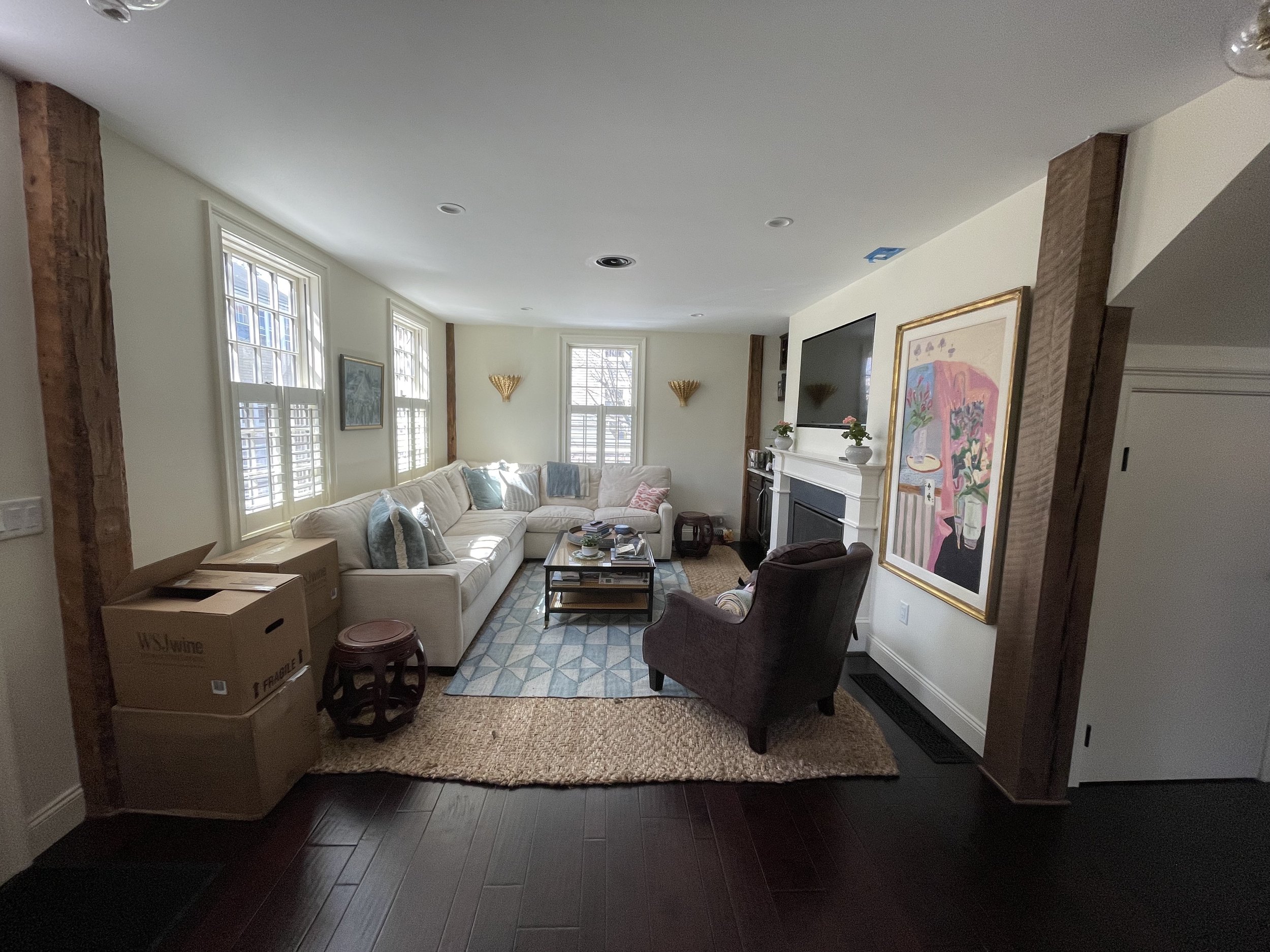
The client’s came to us asking for help redesigning their living room, home office and dining room. Since, they have already been living in their home for many years, they were looking to freshen up the design.
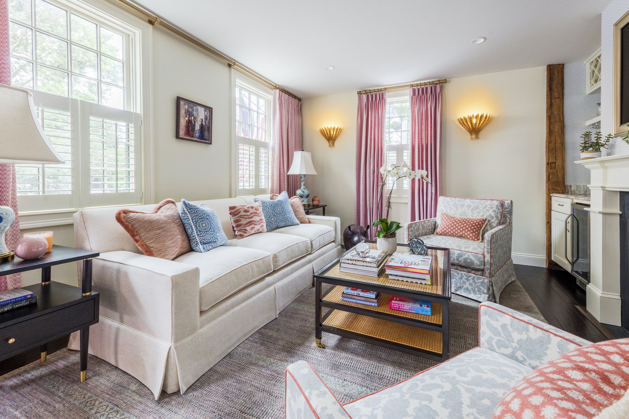
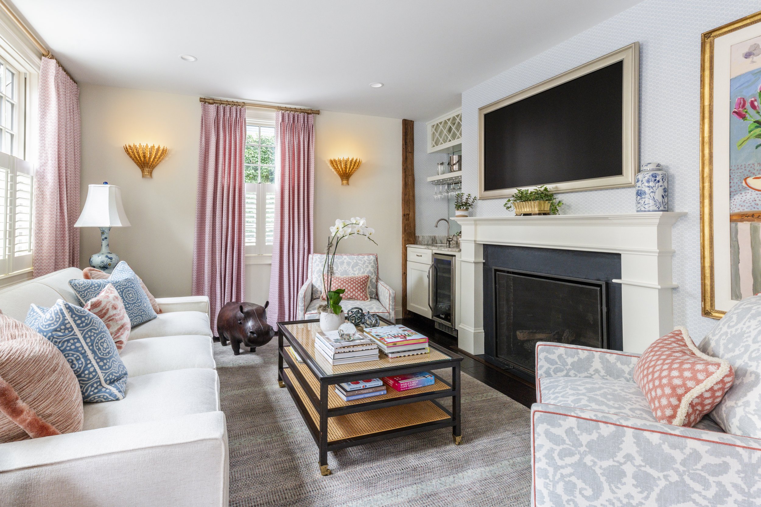
Starting in the living room, the client’s expressed their desire for more color and patterns in order to add more visual interest to the space. On the fireplace wall was a beautiful still life painting, which we used as inspiration when selecting the color scheme. We used a combination of light blues, light pinks and corals for accent pieces such as, the curtains, pillows, and decor.
The living room feels classic & cheerful with the new selections!
Final Selections for the Living Room
For the living room, we designed a custom sofa & armchairs from the MT Company. The client’s felt their existing sectional was too large for the space and were looking for pieces that fit better. It was very important that we found the perfect sofa, with the particular seating depth, back & seat cushion styles, and a dressmaker skirt, per the client’s request. It’s always exciting to design a truly custom piece of furniture because it genuinely brings our client’s joy knowing they have a one of a kind piece. Something that completely fits their level of comfort!
Before & After
Home Office
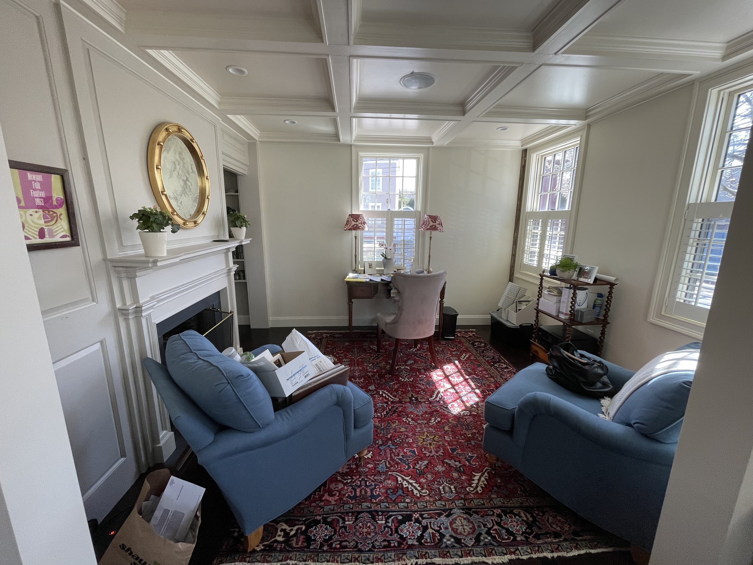
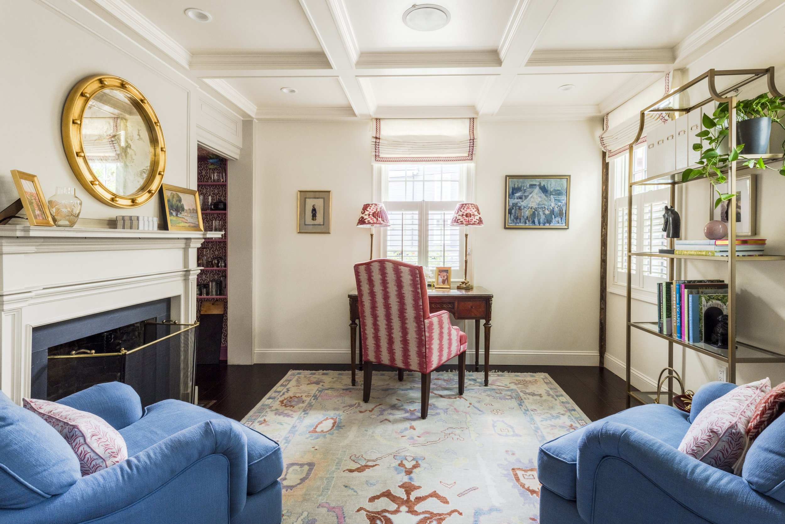
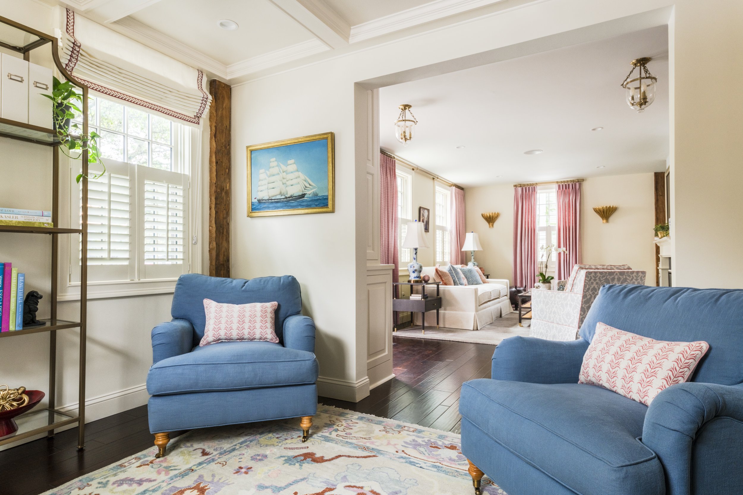
The first thing our client’s mentioned about the home office was how dark the space felt, and they were hoping we could brighten up the room with pops of color. They wanted to add custom pillows to a pair of existing armchairs, add roman shades to the windows, a new area rug and desk chair. Hanging in the office was a vintage Newport Folk Festival poster. The client’s really loved the pinky-purple color used in the print and wished to incorporate more or that color into the design. They also, had a pair of vintage table lamps with red-pink Ikat patterned lampshades, which served as another form of inspiration.
Final Selections for the Home Office
One thing that made the room feel so dark was the combination of hardwood floor and the existing area rug. We knew in order to brighten up the room, we had to source an area rug that was light in color to help balance the dark floor. The rug we selected from Loom & Co. was perfect! It helped to tie in many of the colors that already existed within the office. Then from there, we were able to decide on the fabric patterns for the pillows, desk chair, and window treatments. We sourced prints & patterns that complimented the Ikat lampshades.
Designer Tip: selecting prints & patterns that compliment one another, rather than being an exact match (using the same print) is a great way to make the space feel unique to you and add more visual interest.
Before & After
Dining Room
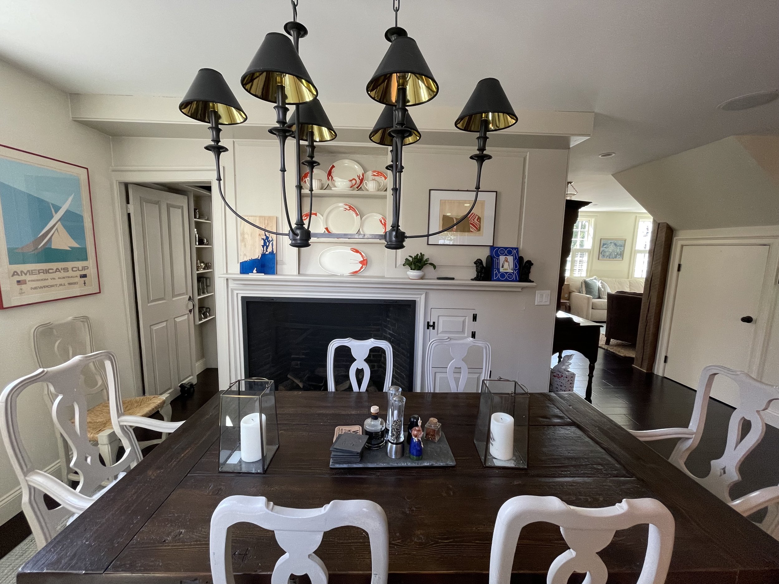
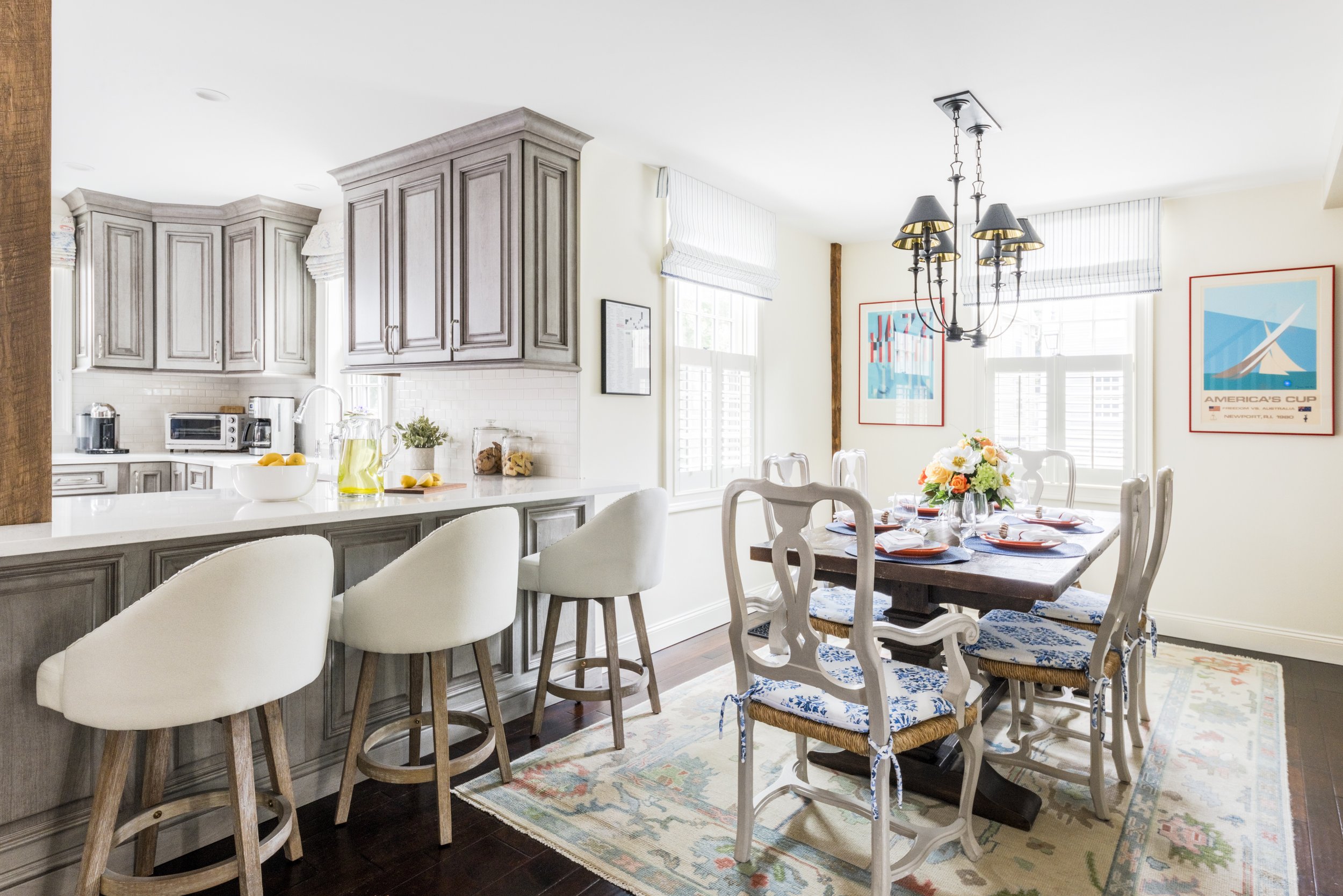
Our client’s envisioned the dining room as a fun space to spend quality time with their adult children and grandchildren. They felt the space was lacking the burst of energy they were hoping to evoke. We decided to use their vintage collection of lobster dinnerware and sailing posters as inspiration for the new color palette. The client’s also requested stain guarded seat cushions for the dining chairs, window treatments and a new area rug.
Final Selections for the Dining Room
One of our favorite elements in this room are the custom roman shades we designed using a blue and white striped fabric from Kravet, decorated with embroidered trim from Thibaut. The striped fabric added a classic touch, while the trim gave the shades a hint of elegance. The decorative trim also had a similar design and color scheme as the fabric we chose for the seat cushions.
It’s these little details that give the overall design a cohesive tailored look!
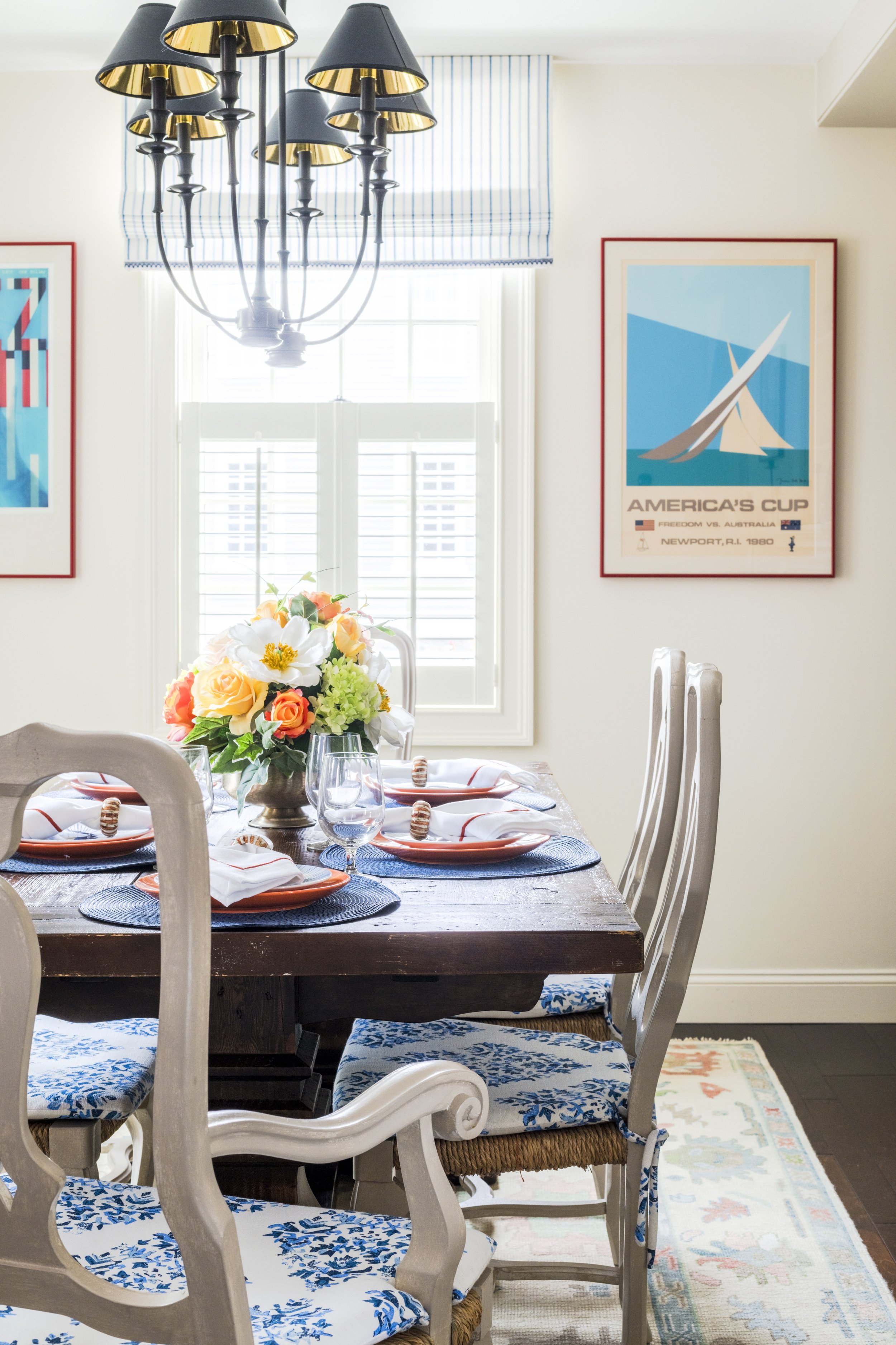
Before & After


