The Hammersmith Residence
Let’s take a closer look into one of our past project, the Hammersmith Residence and how it went from outdated to outstanding!
For this project we renovated and redesigned a home in Newport, RI. The residence is only minutes away from a few of the city’s local attractions, like Fort Adams, Ocean Drive, and the New York Yacht Club. The 2,000sqft condo had to undergo significant updates in order to achieve our goal, which was to give our clients the sophisticated coastal oasis of their dreams.
The clients are a retired couple from Florida, that enjoy traveling to Newport for the summer season. It didn’t take them long to realize that Newport was the perfect place for them to downsize from a larger family home, for a place that fit their current lifestyle. Our clients imagined the home to be a space where they could entertain friends and family while, still feeling comfortable to wind down after a long day. The overall design concept for the home was to provide our clients with a space that was both relaxing and beautiful while, using the surrounding coastal environment as inspiration.
During the conceptual design process, we work with our clients to better understand what they are looking for aesthetically. We compile images, showcasing multiple interior design styles and review them together. This helps us to pin point the client’s likes and dislikes.
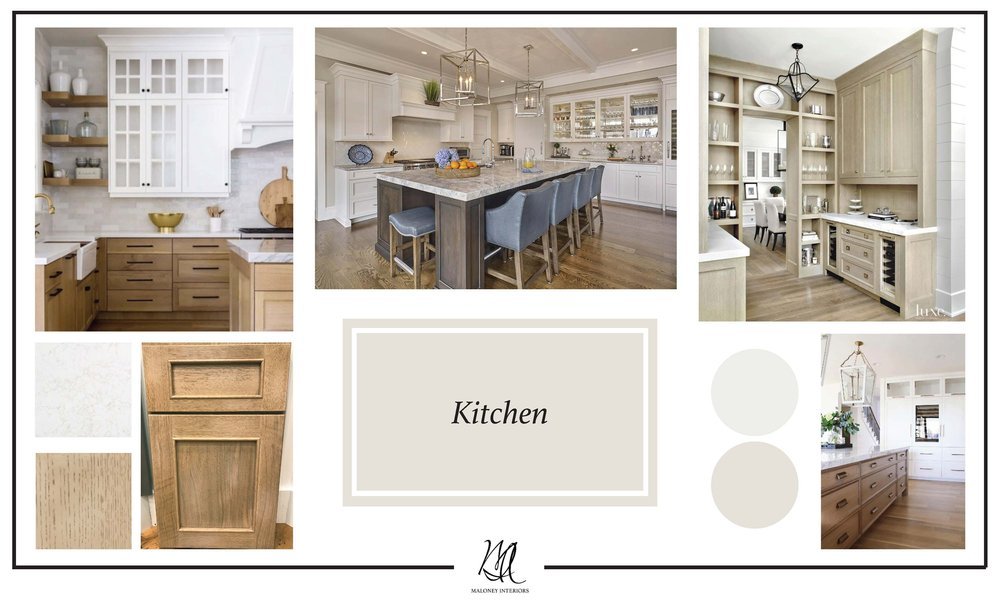
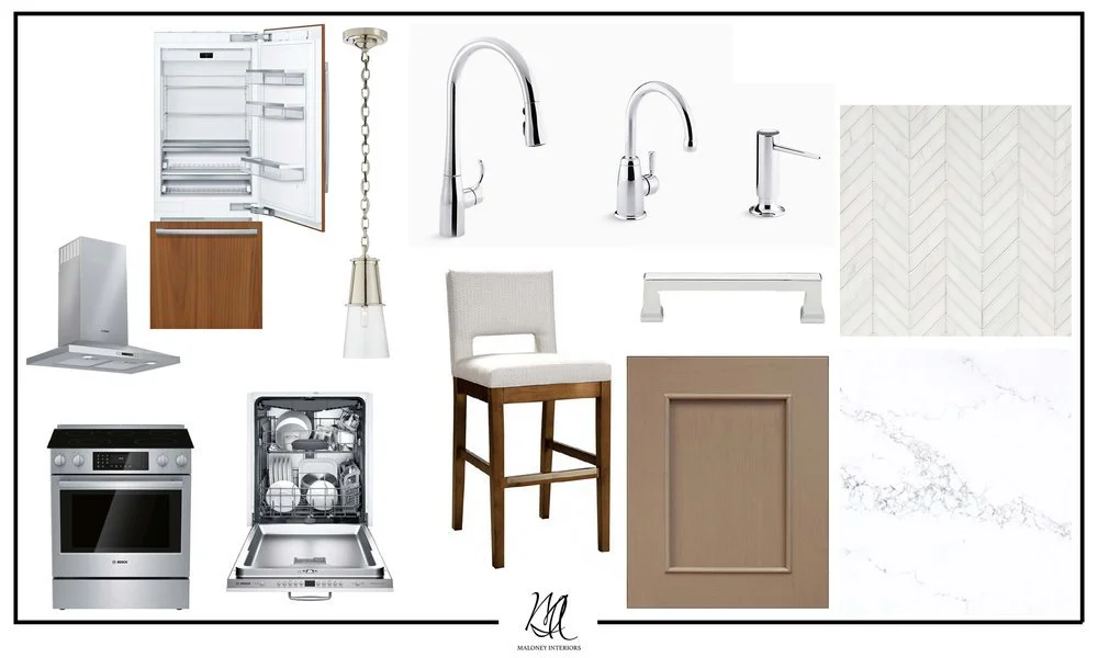
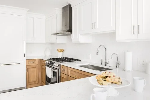
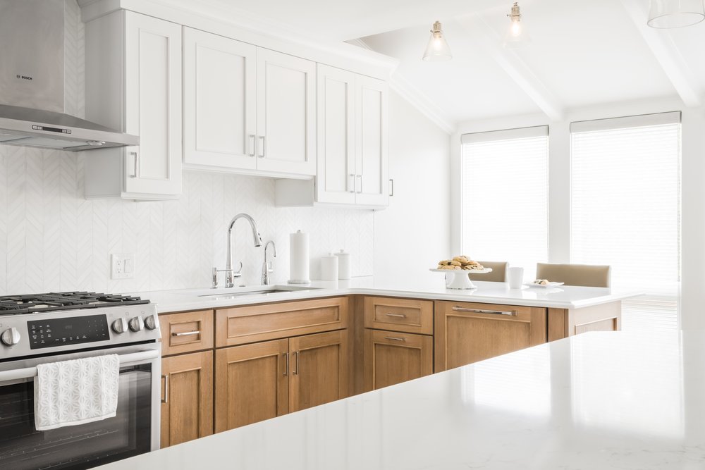
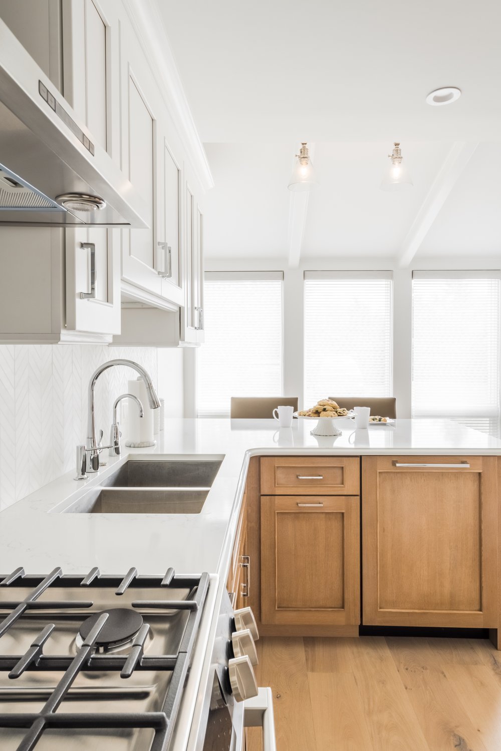
When we began developing the concept for this project, we thought about how we could bring hints of coastal charm in a sophisticated way. Starting with the kitchen, we focused on the materials and how it could feel light & airy. Our clients liked the idea of having two-toned cabinets with white uppers and white oak lowers by Tedd Wood. The white oak has a slightly distressed finish which, is reminiscent of driftwood and the transitional door detailing adds an element of refinement.
In the design development phase of the project, we select all the furniture, fabrics, and finishes for each space. At this time, we brainstorm new floor plan layouts and specific design elements like millwork.
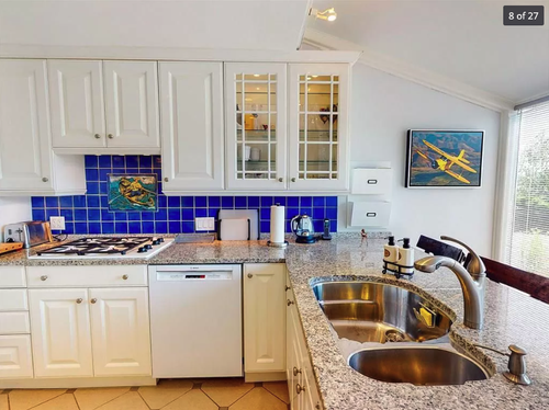
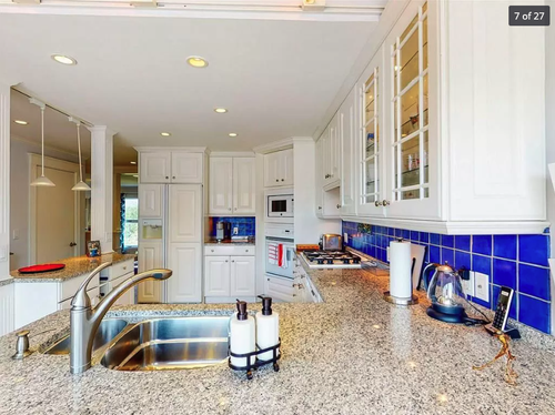
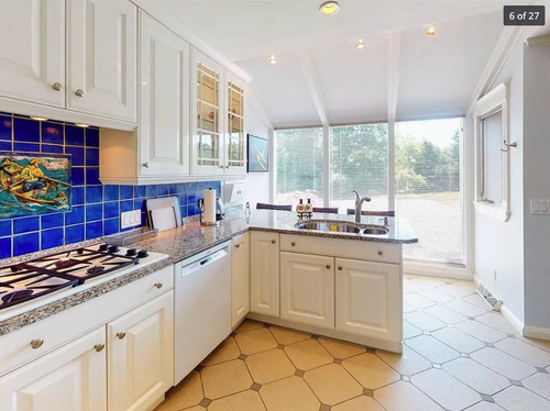
The original kitchen layout for this project felt confide and closed off from the rest of the first floor. Since, the kitchen is the entry to the home we wanted to really open up the space. We removed the columns in front which allowed for direct sight lines. We were able to add more storage with a new peninsula and a pull out pantry. The materials in the space created an open and airy atmosphere with the two-toned cabinets and Bianco Puro honed marble chevron backsplash tile.
Kitchen Rendering - A great tool to help a client & designer visualize the final design.
The Final Kitchen


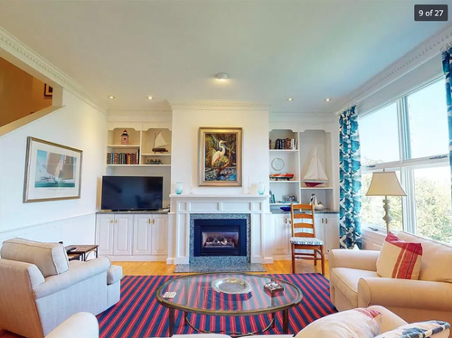
Before & After
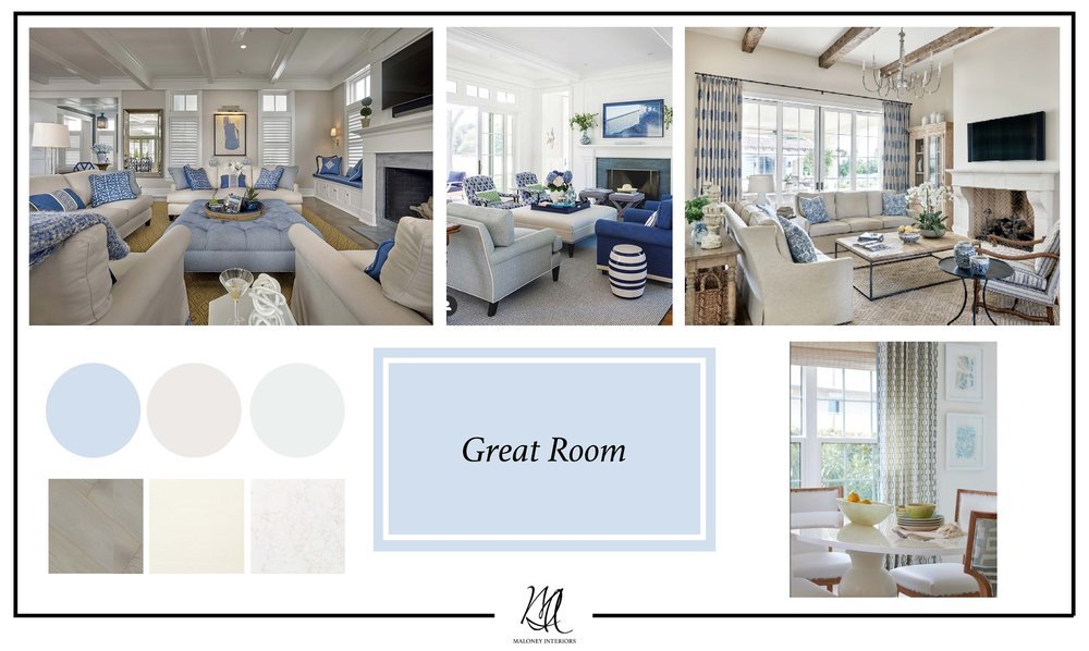
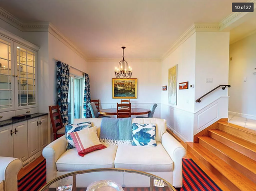
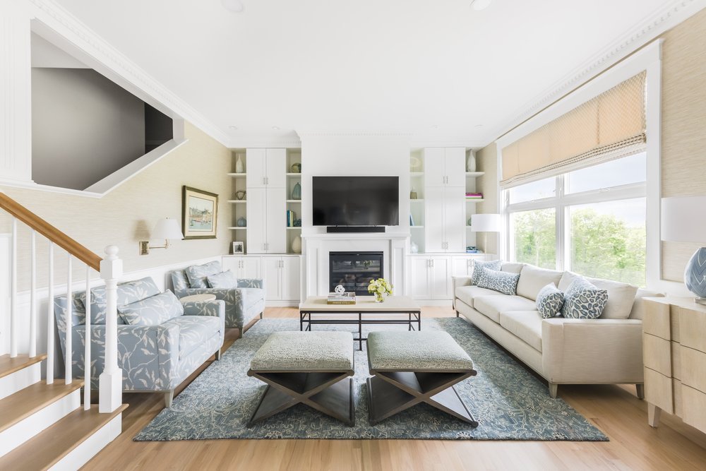
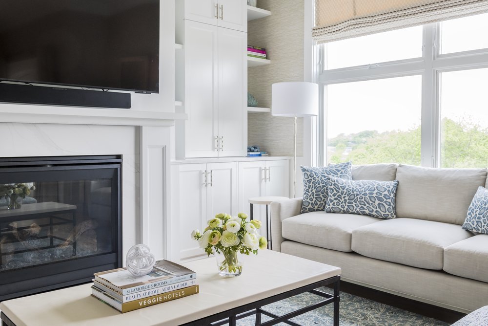
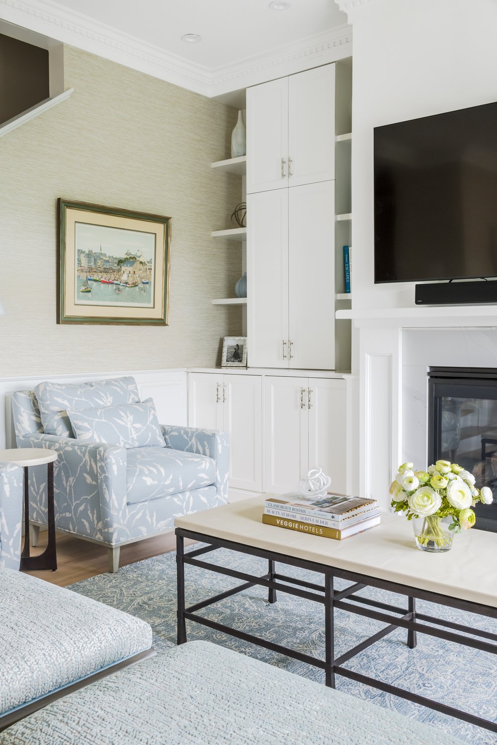
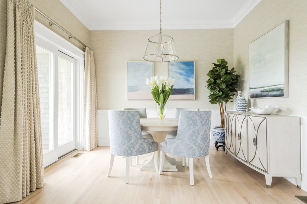
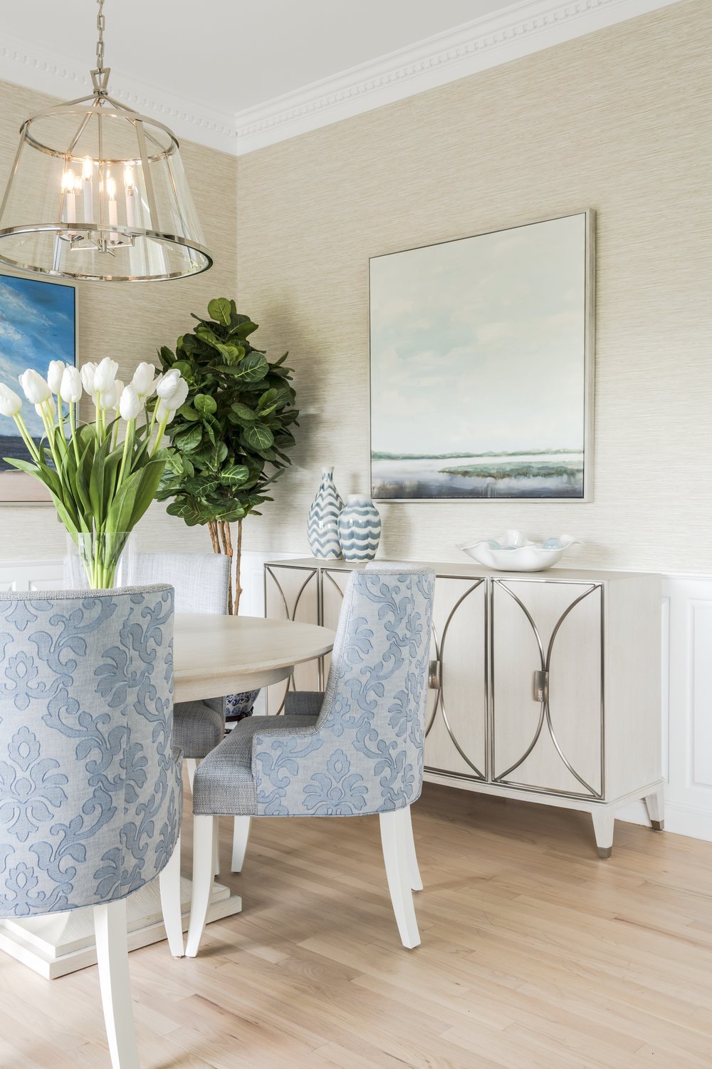
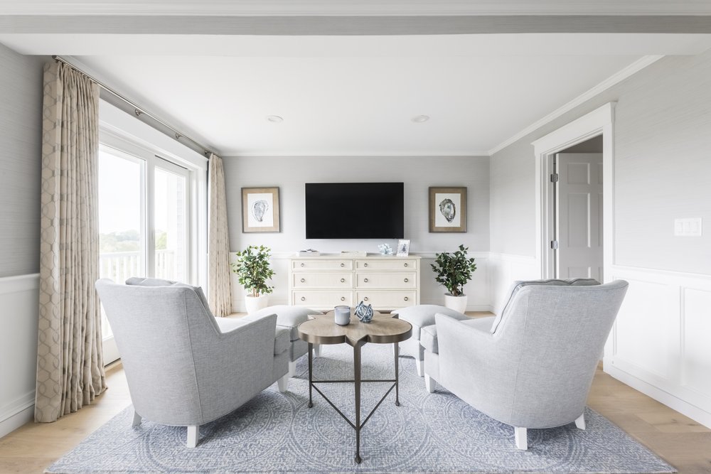
Next, we focused on the great room. In this area, we introduced a neutral color scheme with multiple shades of blue. Our plan was to layer patterns and textures to give the space some depth and interest. This space will provide the opportunity for our clients to entertain guest as well as, relax after a long day.
As we selected furnishings and decor for the project, we made a point to use the coastal surroundings as our inspiration. We looked for furnishings in light wood tones and prints that alluded to nature. One of our favorite pieces are the two armchairs from The MT Company upholstered in a modern botanical fabric print from Romo.
Great Room - Rendering of Seating Area
Great Room - Rendering of Dining Area
The Final Great Room

Before & After
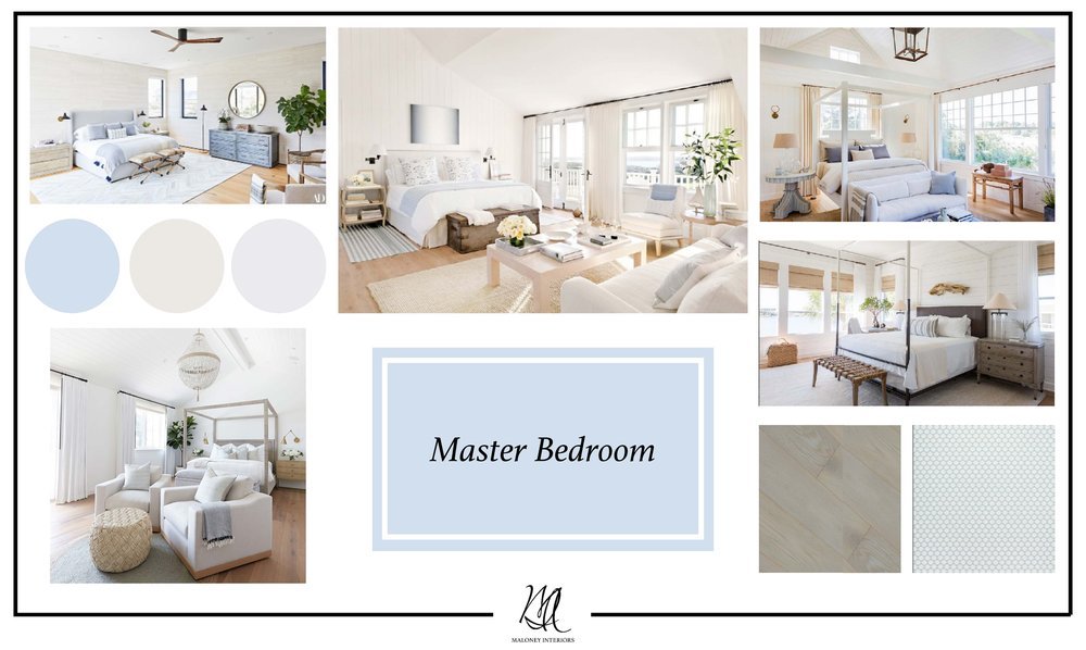
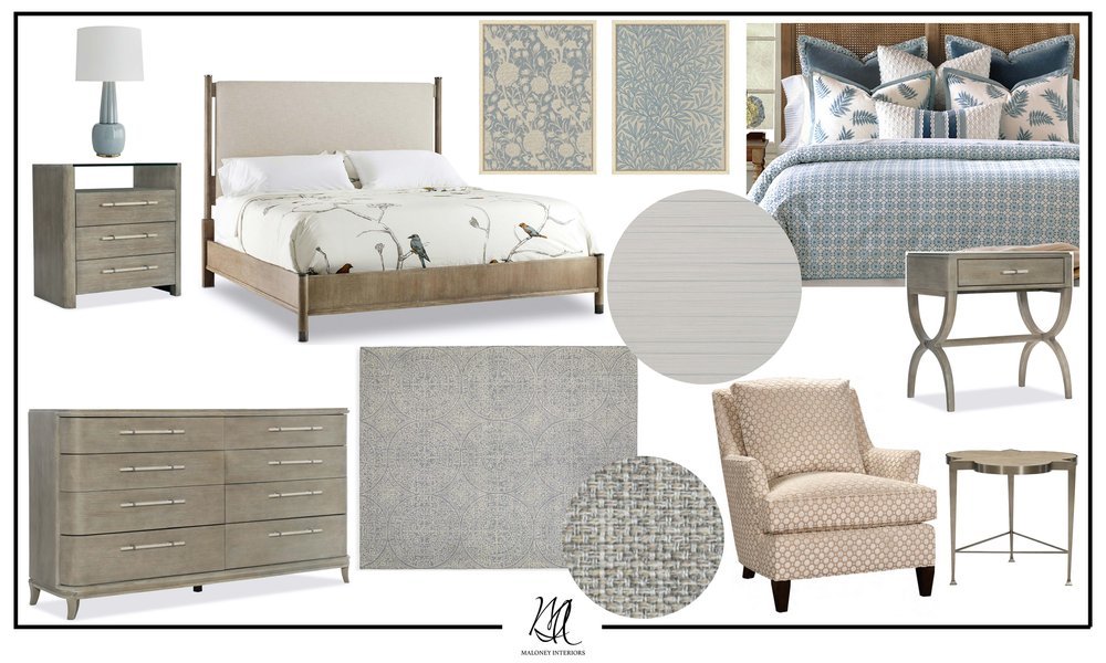
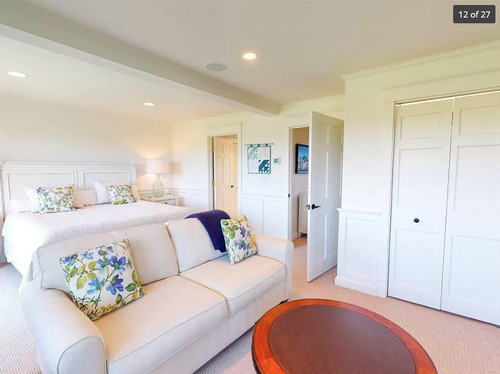
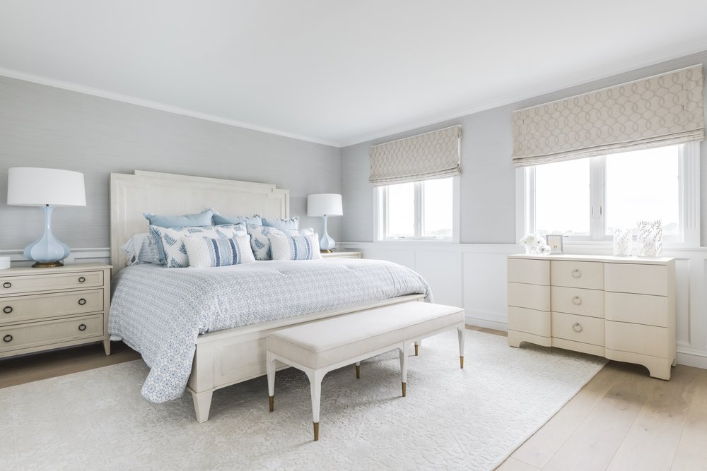
In the master bedroom, our goal was to find a balance between luxury and comfort, which we would achieve by layering patterns and textures. The overall neutral color palette with hints of blue adds a coastal touch, similar to the design of the great room. The perfect spa getaway!
Master Bedroom - Option 1: a more traditional coastal feel, with softer elements.
Master Bedroom- Option2: a touch more modern, with dynamic casegoods.
Often times when we are selecting furnishings and decor we find a couple of options we think the client would like. This is a great way for the client to see we can achieve a goal in many different ways.
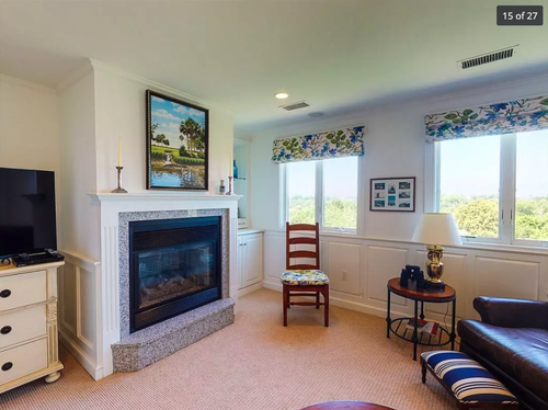
When reviewing the floor plan of the master bedroom, we decided to remove the existing fireplace and flip the orientation of the existing furniture layout. Our clients really wanted to maximize the amount of space in the room, so removing the fireplace was a great solution.
The Final Master Bedroom
Before & After
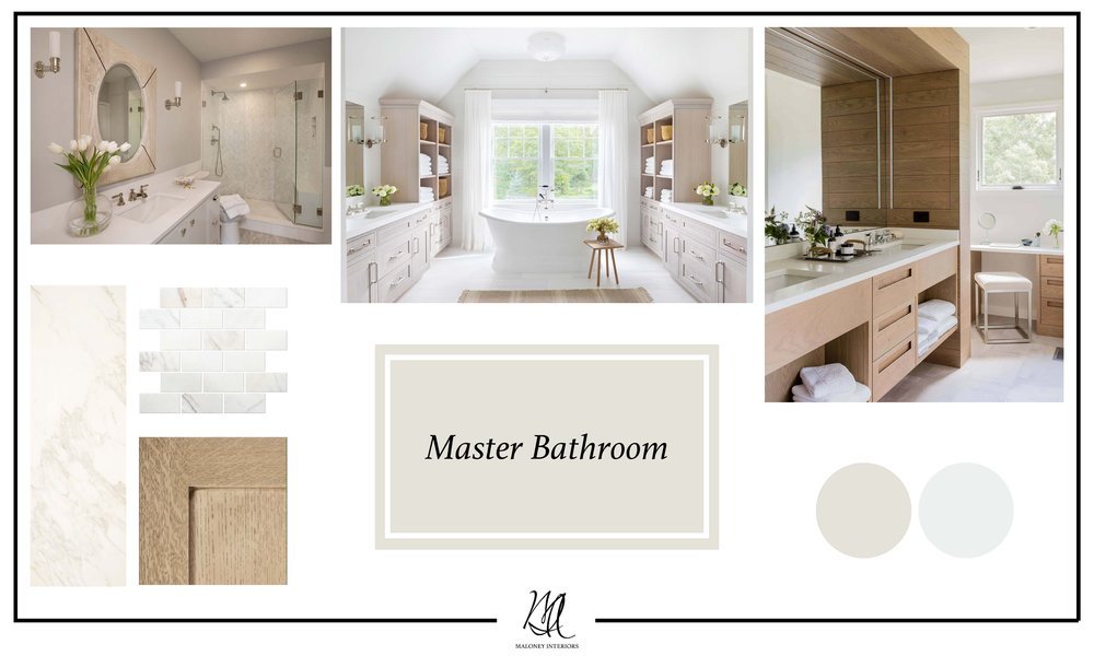
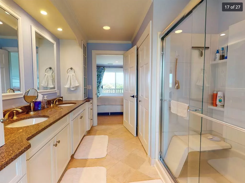
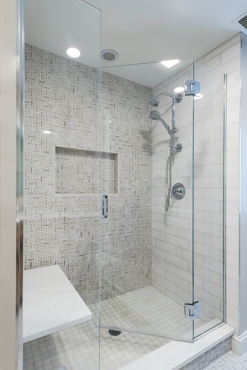
The concept for the master bathroom was meant to feel like an oasis. We planned to achieve this look by using a neutral color palette and allowing the natural materials we selected, like white oak cabinets and marble tiles to be the main attractions.
In these drawings we explored two different layouts for the laundry area.
As we began selecting materials and finishes for the master bathroom, we discovered a beautiful basketweave marble tile. We decided to use this tile on the main floor of the bathroom and act as a focal wall in the shower. This tile inspired many of our selections for this space such as, the white oak cabinets that compliment the stone very nicely.
Rendering of Master Bathroom
The Final Master Bathroom

Before & After
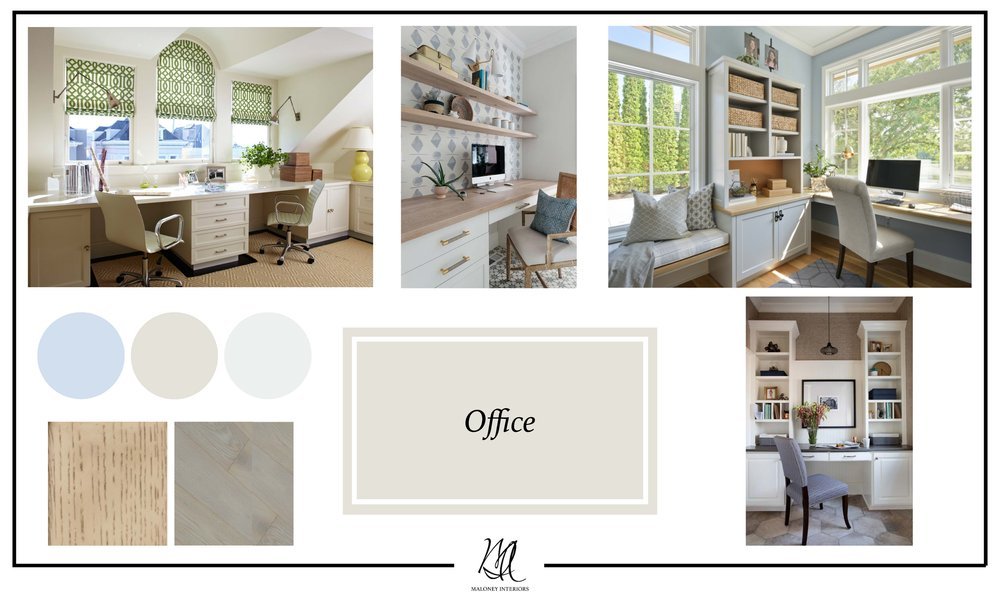
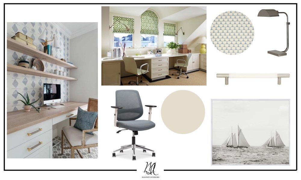
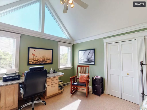
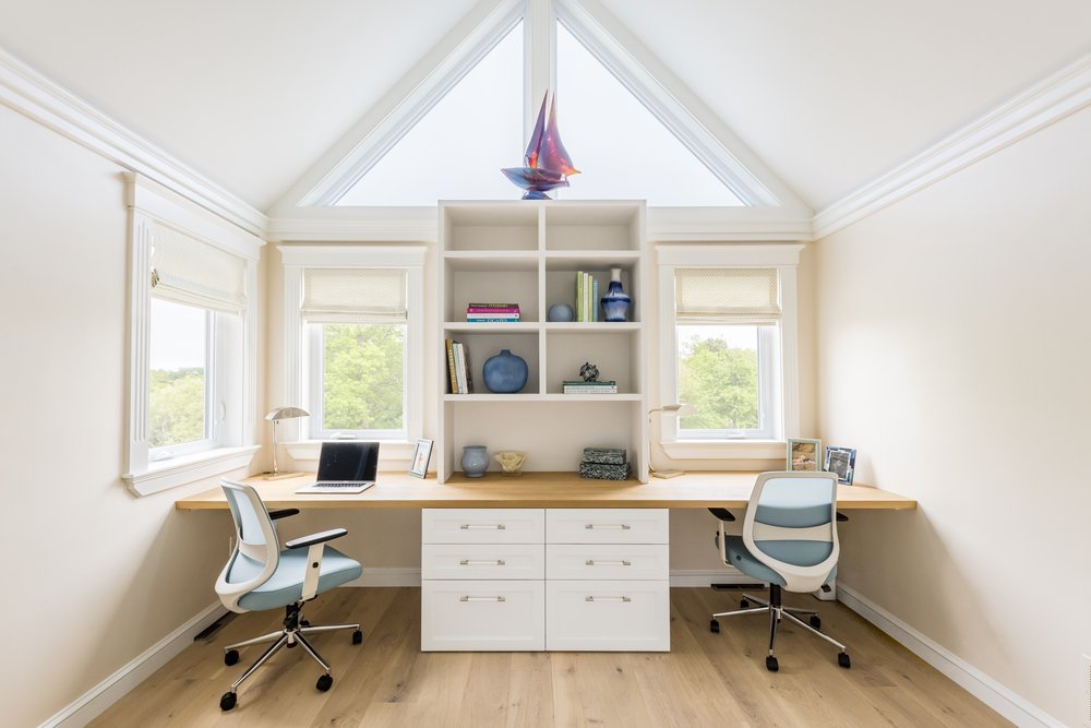
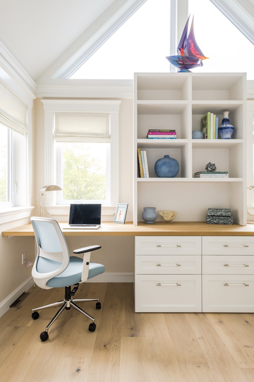
This office was a perfect opportunity to design a custom desk and storage for our clients. We proposed multiple design options for the desk, which helped guide our clients as they thought about which option would best suit their needs. Even though, the main focus in this space was the millwork design, we like to think of the room as a whole. The windows allowed us to introduce a little color and pattern that really enhanced this tailor made look we were going for.
Our clients decided on a book case style shelving for above the desk and drawers below. We selected white oak for the desk top and a white paint finish, a similar look to the kitchen and master bathroom. Using these elements throughout the home created a cohesive look. One of our favorite details in the room are the nickel and white leather drawer pulls, which are subtle yet a little edgy.
The Final Office
Before & After
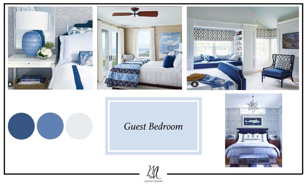
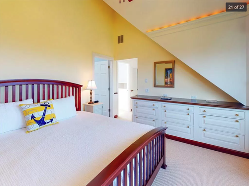
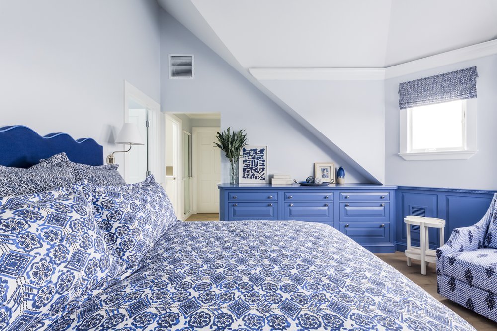
In the guest bedroom we wanted a bold and unexpected look. A monochromatic color palette is a great way to make a statement and still achieve a cohesive look. Our plan was to layer the different shades of blue and different patterns to create a playful mood. Our clients wanted the space to remind their guests to have a little fun!
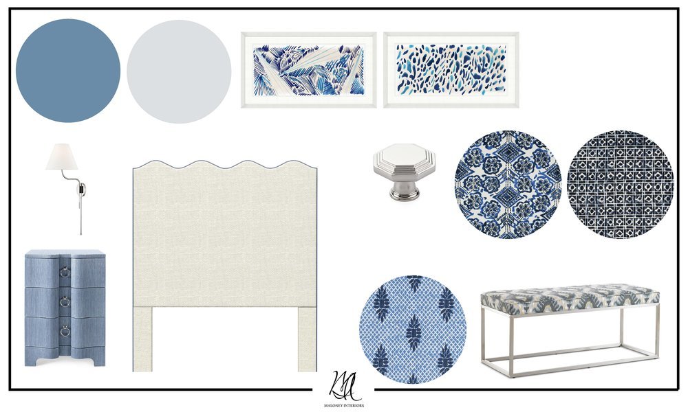
The guest bedroom already had beautiful custom millwork so, we decided to paint it a shade of blue that became the foundation for the rest of our selections. We found a unique wavy headboard from Oomph which we had upholstered in a navy and periwinkle blue trim. We selected bedding from Eastern Accents that brought some fun patterns into the space. The tailored look felt very coastal chic! Even the final details, like the artwork from Wendover Art made the room feel like a complete look.
The Final Guest Bedroom


Before & After
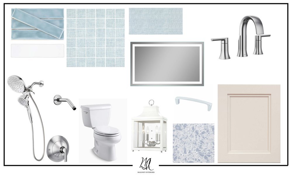
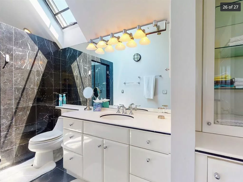
In the guest bathroom our goal was to layer multiple shades of blue through out the space, to compliment the design of the guest bedroom. The blues are more subtle compared the the richer blues in the bedroom, however we still would like the room to feel playful through the use of the finishes.
Guest Bathroom- Option 1: nautical, playful and sophisticated
Guest Bathroom- Option 2: coastal and charming.
We proposed two designs for our clients to help them decided which shades of blues they liked best! Our clients chose the lighter more powder blue tile selection, which complimented the design in the guest bedroom nicely. We wanted to also incorporate a focal wall in the shower using light blue glass scalloped tile. One of our favorite elements of this bathroom is the vanity countertop which is a stunning blue quartz.
The Final Guest Bathroom
Before & After
The final designs for this project are better than we imagined. Home renovations can be a daunting task however, with the expertise of an interior designer your dream home can become a reality. Let’s make it happen!

