The Seaside Farmhouse
Let’s discover how this outdated home transformed into a modern treasure!
For this project we completely renovated and redesigned our client’s home in Portsmouth, RI. The client’s are a husband and wife from New York, who make frequent trips to Boston to visit their adult children. They decided it was finally time to purchase a permanent residence in Rhode Island, the perfect retirement location! The home is located near some of Rhode Island’s most popular beaches, golf courses, and vineyards.
The client’s wanted the design of the home to be a modern take on a seaside farmhouse, but with an edgy twist. The home should also allow for easy entertaining of friends and family. We achieved this through new floor plan layouts, modern details and sophisticated color palettes.
The Mudroom
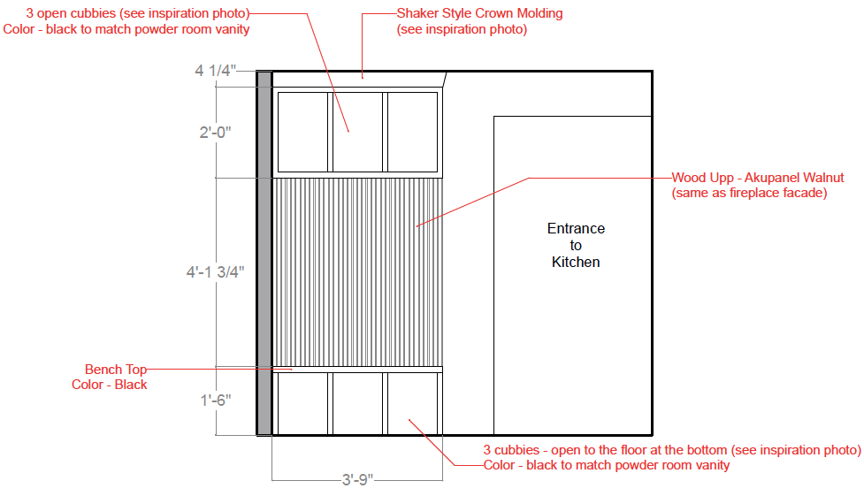
When you first step into the home, you are introduced to the mudroom. The client’s wanted this space to have both personality and functionality. We included a built-in seating bench with storage so, they have a designated spot for shoes, hats, gloves, etc. (all those items you need when running out the door!) During the conceptual design phase, we gather inspirational images for the client to review and provide feedback on. For the mudroom design, we decided on a neutral color scheme of black and white with gold and wood accents.
When selecting the materials for the mudroom we focused on items that would bring the modern farmhouse style, like the herringbone tile floor. The built-in bench design has a transitional feel by using a sleek crown molding, modern wood paneling and a bold black paint color.
The Pantry / Laundry
The concept design for the pantry / laundry room is an extension of the mudroom. The overall design for the space included a black, white and gold color scheme. We continued the herringbone tile floor into this space, which created a easy flow from the mudroom.
We thought adding wallpaper behind the open shelving would create a more visually appealing space. Our client’s selected a small scale print from Scalamandre, it’s black stars and gold dots tie in perfectly with the gold and black light fixture from Visual Comfort.
Before Photo:
Powder Room
The powder room shares a similar design concept as the adjoining mudroom and pantry / laundry room. The color palette includes black, white and gold accents. However, we still wanted the room to feel unique, so we introduced new materials.
We introduced black shiplap and a dynamic geometric floor tile. The shiplap speaks to the modern farmhouse style and the flooring adds a bit of a modern edge. The metal finishes add a sophistication to the room like the brushed gold faucet from Moen and the sleek glass pendents from Hudson Valley Lighting Group. This room is very dramatic, but in the best way!
Rendering of the Powder Room
Final Photo of the Powder Room
Before Image:
The Kitchen
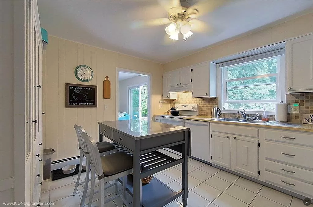
For the kitchen design we wanted contrasting materials. We thought a dark wood finish on the base cabinets and a painted white finish on the upper cabinets would bring the farmhouse style into this space. For the countertops we chose a more modern combination, using a black stone on the perimeter cabinets and a white stone on the island.
Our clients enjoy hosting parties for friends and family so, it was very important that the layout of the kitchen could accommodate many guests. One way we were able to achieve this goal was designing a central kitchen island large enough to seat five people. It’s a great place for the guests and hosts to socialize while cooking up some delicious meals! The pendent lights above the island are a favorite of ours! They are a lantern style fixture, which speaks to the farmhouse style, while the black and gold finishes make the lights feel very modern.
Rendering of Kitchen
Final Photo of Kitchen
Before Photos:
The Bar Area
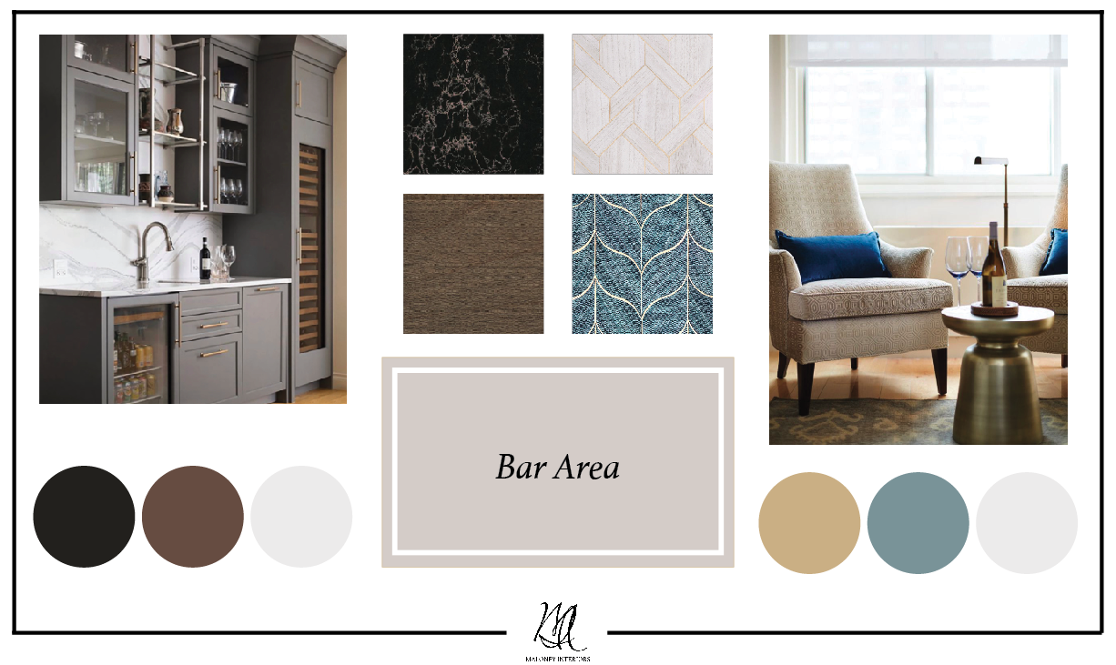
Since, the bar area is an extension of the kitchen, we carried over the dark wood cabinetry and black stone countertop. However, we still wanted the bar to stand out from the kitchen. Our clients really liked the color teal so, we thought creating a focal wall using that color could bring a hint of a coastal element into the design.
When selecting the furnishings for the bar we chose a fun seating area for the guest to socialize and enjoy a drink together. The round table and four counter stools, upholstered in a teal velvet fabric feel lush and intimate. The wallpaper we selected for the focal wall is designed by Philip Jeffries. The material is dyed grasscloth on a metallic gold ground. The pattern is reminiscent of fish scales or a whale tail.
Rendering of Bar Area
Final Photo of Bar Area
Before Photos:
The Dining Area
Next, is the dining area! In this space we used a similar color palette as the bar area, incorporating teals and deep wood tones. The style of the dining chairs compliment the design of the stools at the bar, helping to create a cohesiveness between the spaces. We thought a teal colored fabric and faux brown leather would make the chairs feel sleek and modern.
The dining table can seat up to twelve guests, which is perfect for our clients who love to entertain! Another design element that was very important to the clients was the light fixture over the table. We sourced multiple styles, shapes, finishes, etc. until we found the perfect linear chandelier with a matte black finish and fluted clear glass shades from Visual Comfort.
Before Photos:
The Living Room
In the living room we decided to introduce some light teals and chambrays into the design. As mentioned previously, our clients wanted a hint of coastal inspiration which we explored through the color scheme.
Our client’s wanted the living room to be sophisticated and comfortable for everyday life as well as, special events. The furniture selection played a big part in achieving this goal. We sourced the armchairs and sofas from the MT Company. They have a very tailored look and provided the level of comfort our clients desired. The fireplace is the focal point of the room with it’s oak wood paneling facade and bright white quartz surround. This combination of materials brings in a modern touch. It’s also, a great visual connection between the kitchen and living room with both having warm wood tones.
Before Photos:
The Primary Bedroom
For the primary bedroom, our client’s wanted the space to feel soft and serene but still visually interesting. We thought a focal wall behind the king bed would add some dimension to the space! The color scheme consists of light beiges and taupes, which will bring that light an airy feel the clients are looking for. The addition of a window bench seat and make up vanity add luxury and sophistication to the design.
The focal wall adds a geometric element to the room, while the area rug we selected from Exquisite Rugs has a dynamic organic wavy pattern. Finding the balance between organic and geometric forms makes the space feel more alluring.
Before Photos:
The Primary Bedroom
The concept for the primary bathroom is similar to the primary bedroom, the clients wanted the space to feel relaxing and sophisticated. We achieved this look through the use of tile that incorporated the light beiges and taupes, soft wood tones, and sleek gold accents.
We selected only one style of tile for the entire bathroom, but in order to keep the design from becoming too simple we decided to lay the tile in a herringbone pattern on the main floor, leading into the shower. Then we chose to lay the tile in a brick pattern for the shower walls, to help define that area. For the vanity we selected a warm oak finish and gold hardware and faucets from Delta. The combination of materials really catches ones eye as they walk through the space, creating a focal point in the room.
Before Photo:
The Upstairs Guest Bathroom
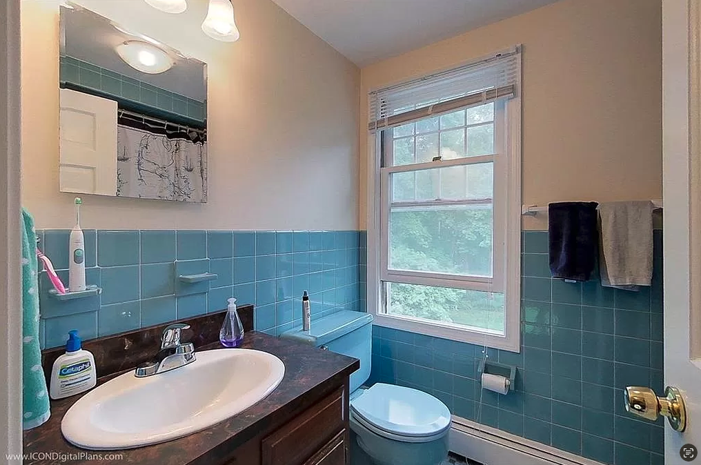
The guest bathroom was the perfect opportunity to have fun with color and materials! For this room the clients wanted a more modern and sleeker look. Based on the inspiration images we collected, we decided to incorporate a light blue / teal tile for the shower walls, as well as, the wall behind the vanity. This color is a call back to the blues / teals on the first floor.
The blue tile paired with the light wood finish on the vanity brings a coastal touch to the room. We chose to lay the tile in a stacked pattern because it felt more modern than the traditional brick layout. The matte black accents and hanging geometric pendent lights make the design feel a bit edgy.
Before Photo:
Guest Bedroom 1
For the two guest bedrooms, the clients wanted each space to have it’s own personality, but still feel cohesive. In the first guest bedroom our color scheme uses lighter blues and teals. The concept for this space was to feel funky and fresh!
When sourcing the materials for the room we found a printed wallpaper from Osborne & Little that created the perfect focal wall. The pattern is reminiscent of leaves or ocean waves, bringing in the hint of coastal flare. The watercolor prints from Wendover Art help to bring in a modern edge, while tying in the black table lamps on each nightstand.
Before Photos:
Guest Bedroom 2
For this guest bedroom our concept was to use a similar color palette as the other guest bedroom, just using deeper and richer shades of teal. We also, wanted to have a fun bold patterns and experiment with using color in a unexpected way.
One way we were able to introduce a color unexpectedly was painting the ceiling in Benjamin Moore’s Azure Water. This color really created the perfect foundation for the rest of the furnishings and decor selections to really shine! One of our favorite pieces in the room is the upholstered bed frame from Eastern Accents. The lucite feet add a hint of glamour to the design and the Annie Selke rug really ties all the colors together!
Before Photo:
The Rec Room
Our clients wanted to create a casual space to spend time with family and friends on the basement level. The concept for this room was to create a design that utilized various shades of blues, light wood tones and small scale prints that evoke the farmhouse coastal style throughout the rest of the home.
The large sectional and pair of armchairs from Fairfield Chair offer maximum comfort. The ottoman and stacked coffee table from William Sonoma brings flexibility, since you can remove the table when not in use for an ottoman everyone can use. We decided to paint the wall with the TV in Ocean City Blue from Benjamin Moore, which really brightens up the room!
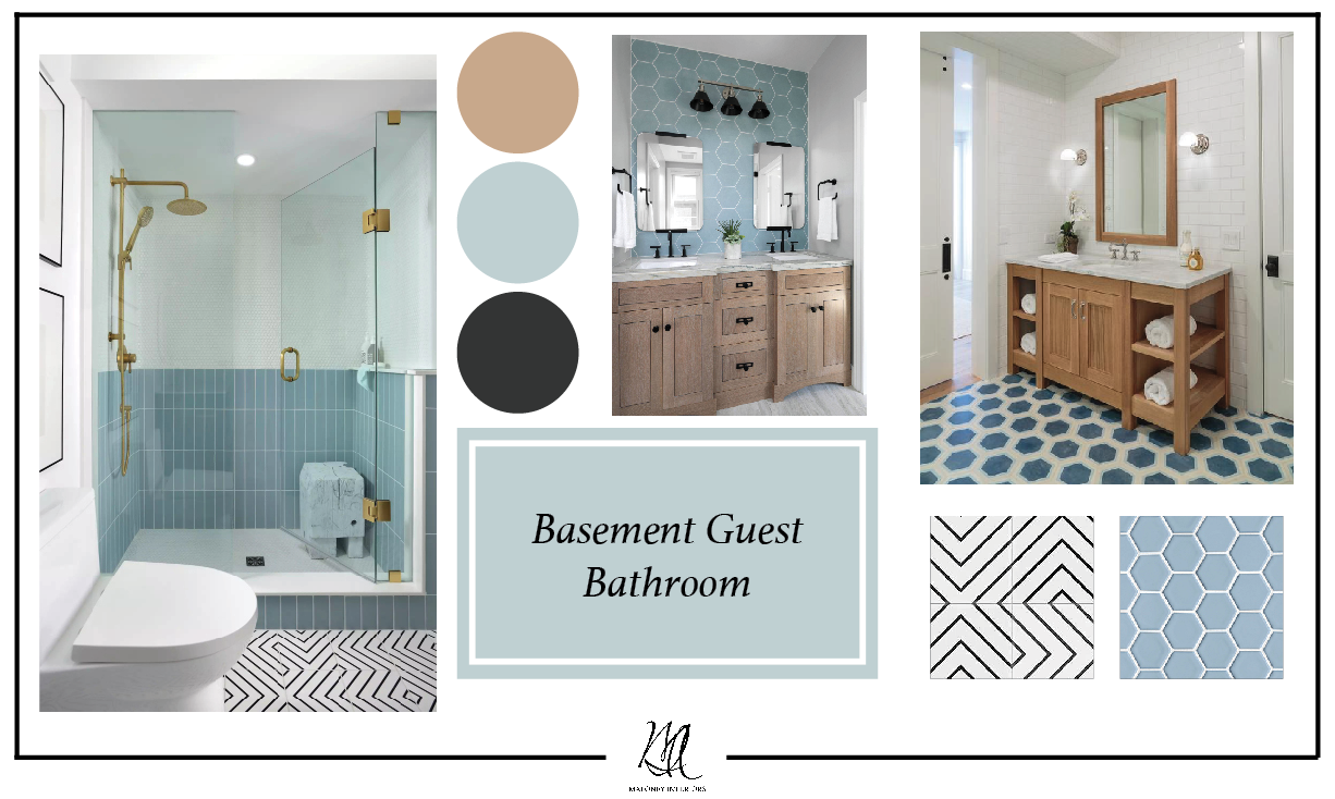
The Basement Guest Bathroom
In this bathroom we wanted the design to be fun! Since the room is right off the rec room, we used a similar color scheme of blues, teals, and light wood finishes. We suggested mixing patterns and shapes to really make the space more playful.
We thought a blue hexagon tile for the shower walls, paired with a black and white patterned tile on the bathroom floor, would really make a statement. For the vanity, we selected a white oak finish to add a coastal hint, while the black accents add a modern touch.
Rendering of Basement Guest Bathroom
Final Photo of Basement Guest Bathroom
We are so grateful to have been apart of this design journey! On to the next!


