The Brenton Cove Project
Let’s dive deeper into the design process and see how The Brenton Cove Residence became a modern masterpiece.
For this project we renovated and redesigned a waterfront home situated in Brenton’s Cove, Newport with stunning panoramic views overlooking Fort Adams, Newport Harbor, and the Newport Pell Bridge. The 2,500 sqft residence had not been updated since the 1980’s so, there was a lot of work to be done to create a modern home for the young couple from Boston.
Our clients were looking to design a space that captured their vibrant personalities and in order to reflect their style we incorporated a combination of patterns, textures, and colors to create and urban chic design. The waterfront views were an element we all agreed should be incorporated in the new layout. Our goal was to open up the space and allow for unobstructed views of the beautiful harbor from all angles of the home. This design decision allowed for an easy flow and openness through out the main level of the home, along with the opportunity to design some unique spaces.
The Living Room
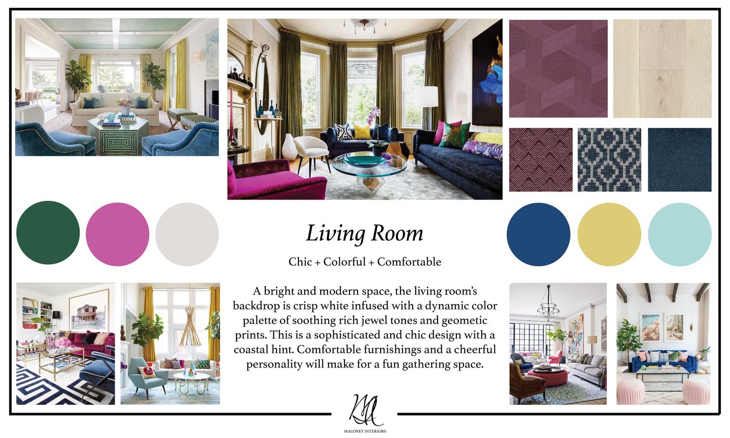
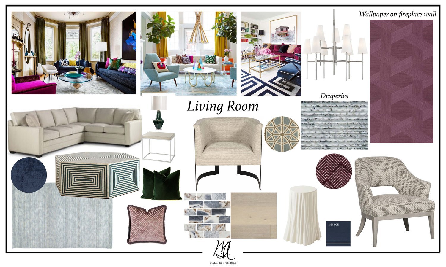
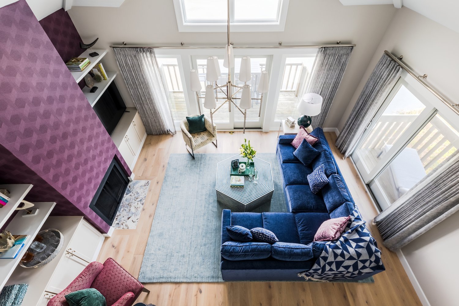
When creating a concept design board we gather inspiration images, color palettes, materials, furniture, decor and floor plan layouts. This helps with further understanding the client’s likes, dislikes, and ultimate vision for the space. The design intent for the living room was to have a white backdrop infused with dynamic colors through the furnishing and decor. We suggested a modern wallpaper on the fireplace wall could be a fun element and create a unique focal point in the room.
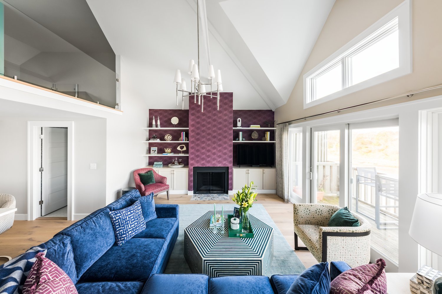
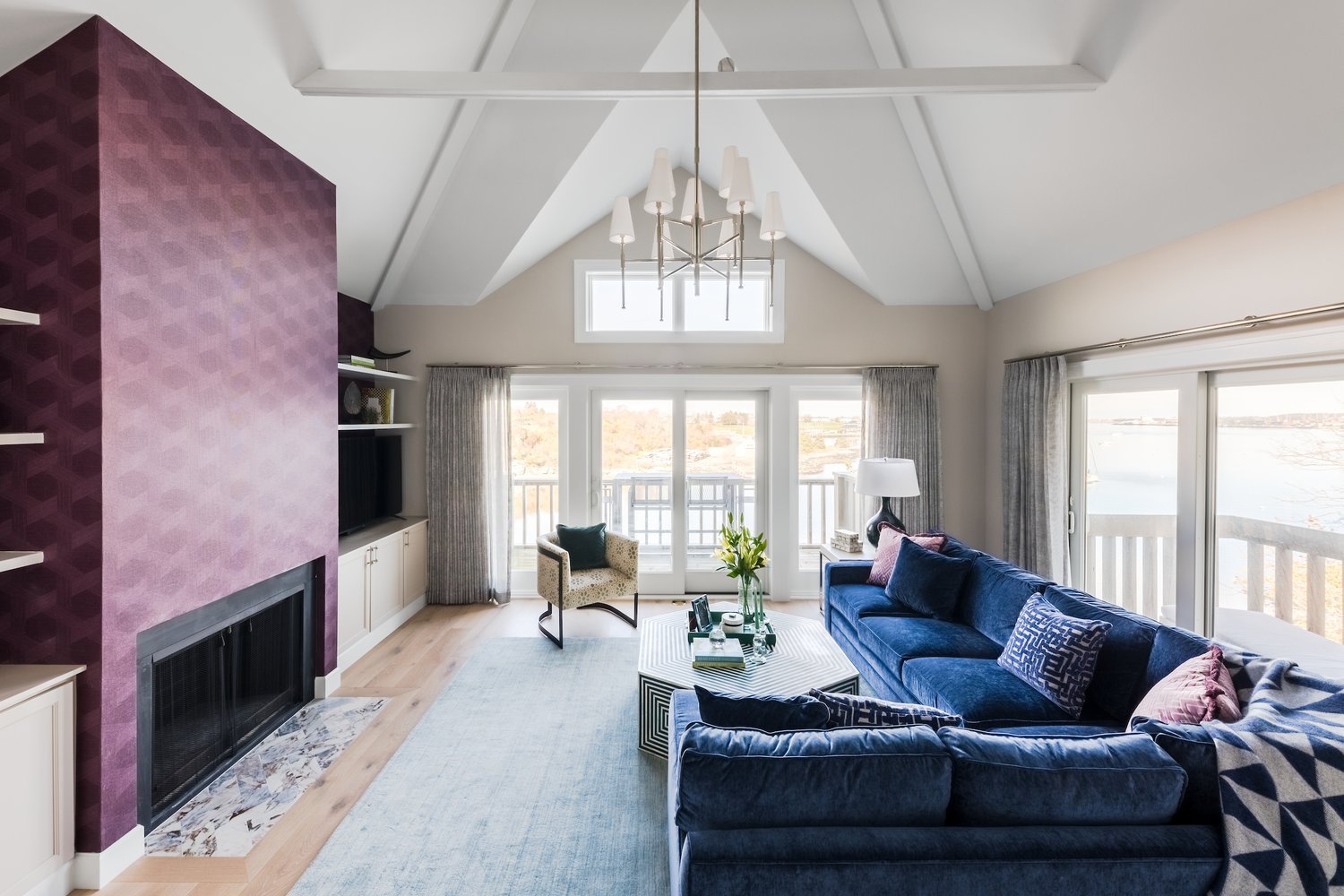
Once we were able to solidify the concept, we began the detailed design phase where we’ll refine and finalize the fine details that make each project special. One of our favorite pieces in this room was the custom bone inlay coffee table. The hexagon shape coordinated well with the other dynamic patterns. Since, the clients wanted to use the space to gather with friends and family, we specified a sectional from the MT Company. The large L-shape sectional makes it easy for everyone to gather around!
Rendering of the Living Room
Completed Project Photos
Before & After Photos
The Kitchen
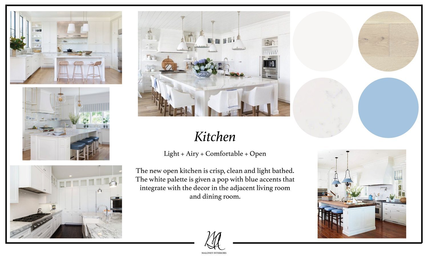
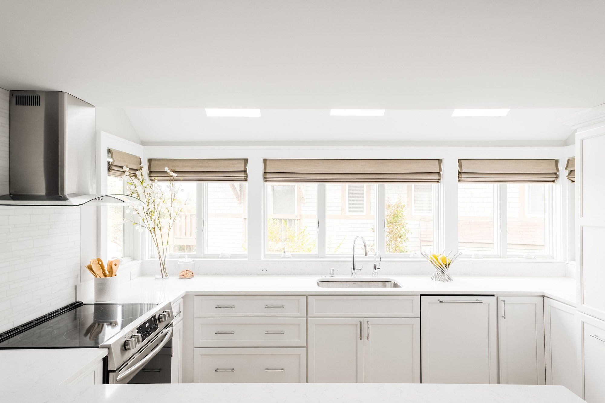
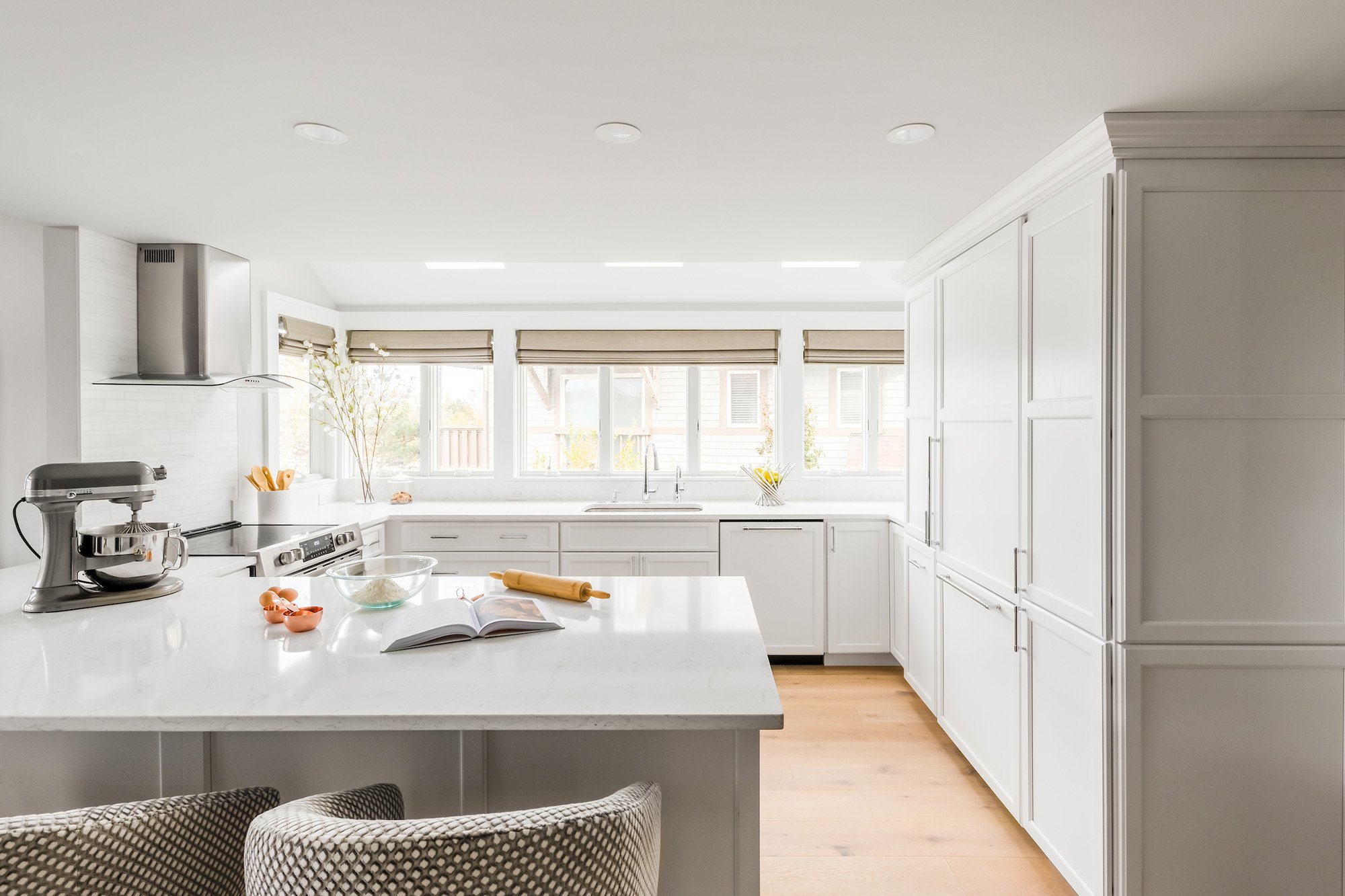
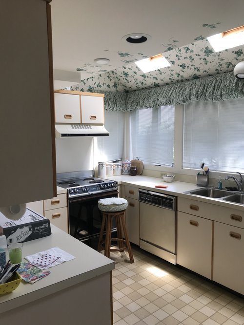
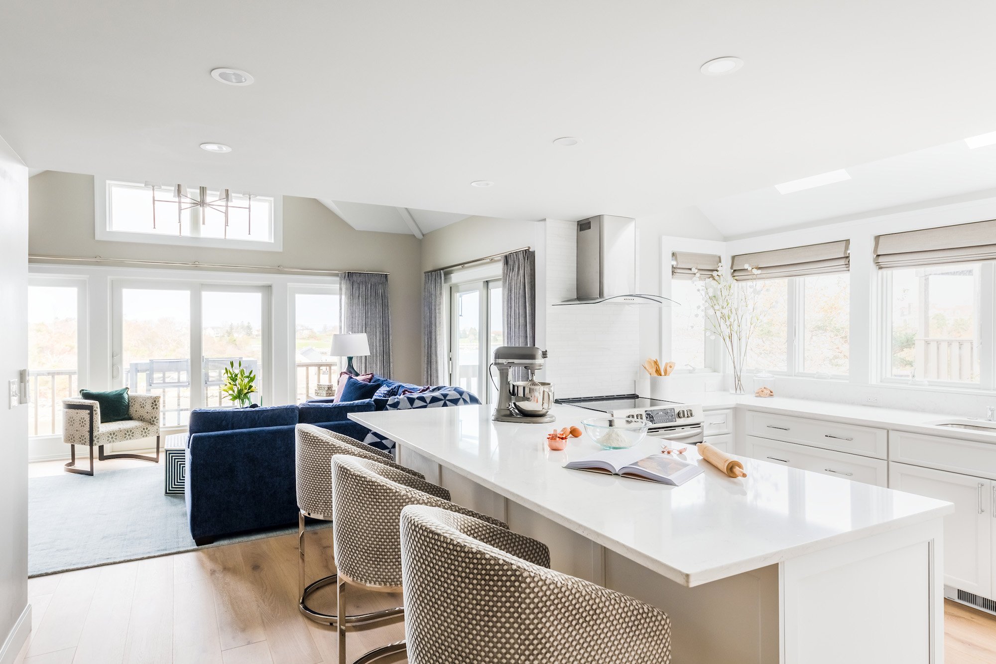
The concept for the kitchen was to design a space that felt open and airy. We planned to achieve this through removing a few walls that blocked the kitchen from the living and dining room. Removing the walls created access to the beautiful waterfront views and brought more natural light into the home. As for the materials palette we went with overall neutral finishes and possibly a pop of color through the accessories and decor.
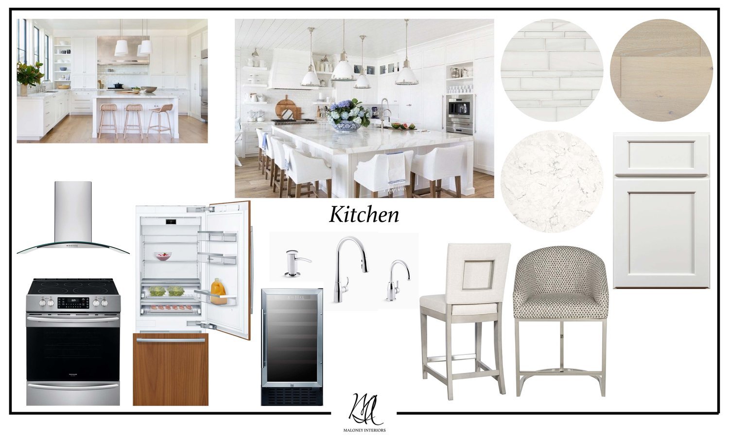
As an interior designer our goal is to find the perfect balance between functionality and visual appeal. The layout for the kitchen is just as important as the components that go into it. As we continued into the detailed design phase we eliminated the pop of color and just focused on a neutral palette. With the kitchen situated between the living and dining room we felt the neutral palette would be a nice break between the two colorful spaces. A few products we specified were Sawyer Mason hardwood flooring, Bianco Puro marble backsplash tile and Bosch appliances.
Completed Project Photos
Before & After Photos
The Dining Room
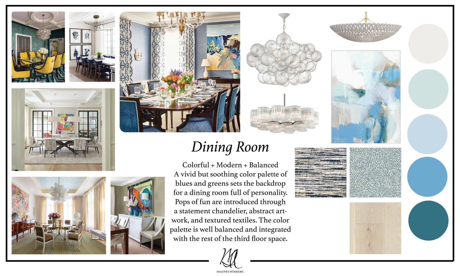
The dining room is a space meant for entertaining! Our clients wanted the dining room to be a fun space to gather with family and friends. The concept for the space focused on color, modern elements, and overall balance. The colors work in harmony with the living room’s rich jewel tones. To introduce elements of fun we selected unique chandelier options and abstract artwork.
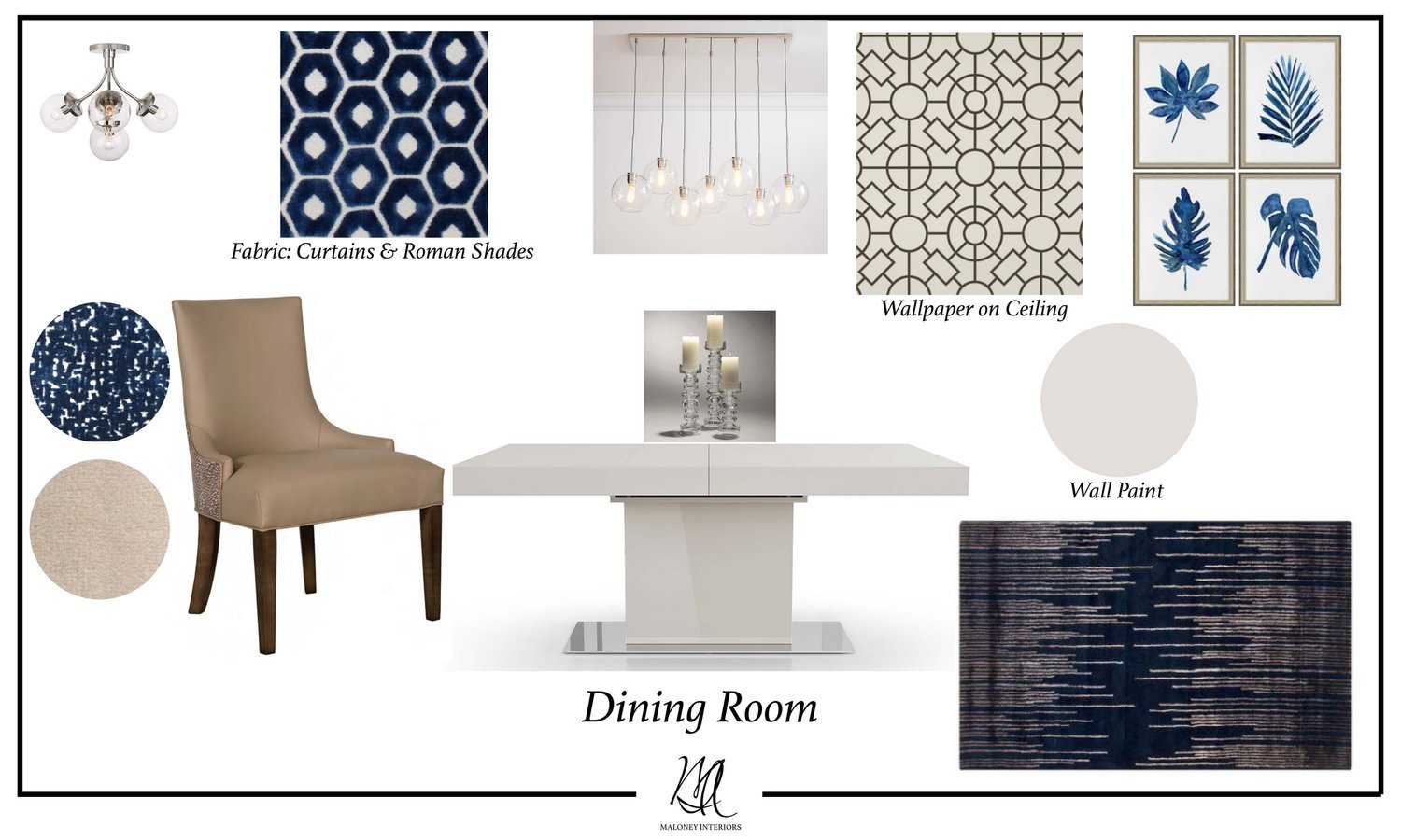
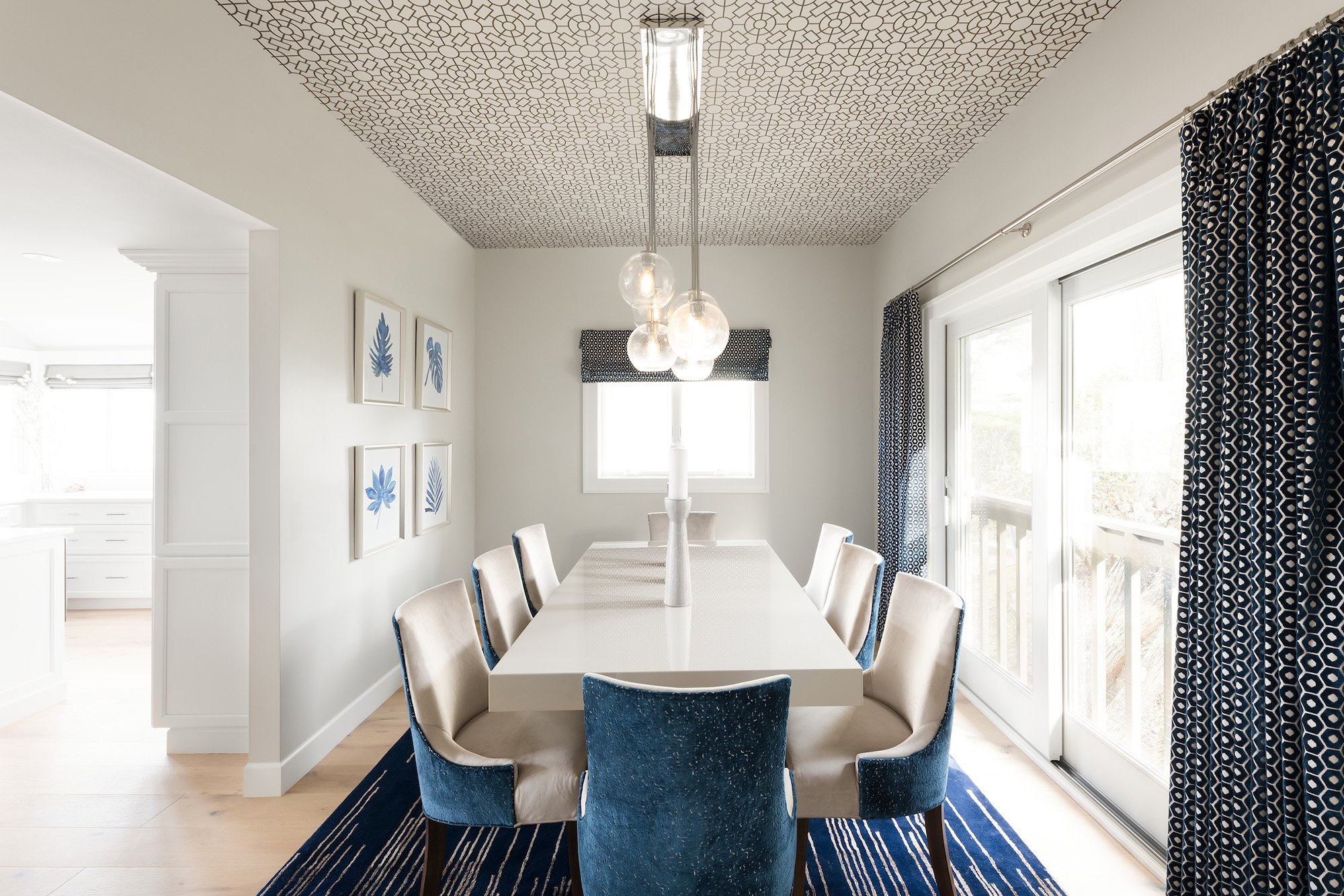
As we continued into the detailed design phase, we had the unique idea to add wallpaper on the ceiling. The placement brings a sense of whimsy and spontaneity to the room. The Modloft dining table is truly a statement piece with the sleek edges and glossy gray lacquered finish. We decided to keep the color scheme minimal with only navy and neutrals. The navy blue adds a drama and elegance to the overall design. A hint of coastal charm was brought to the space through the blue leaf prints from Wendover Art Group.
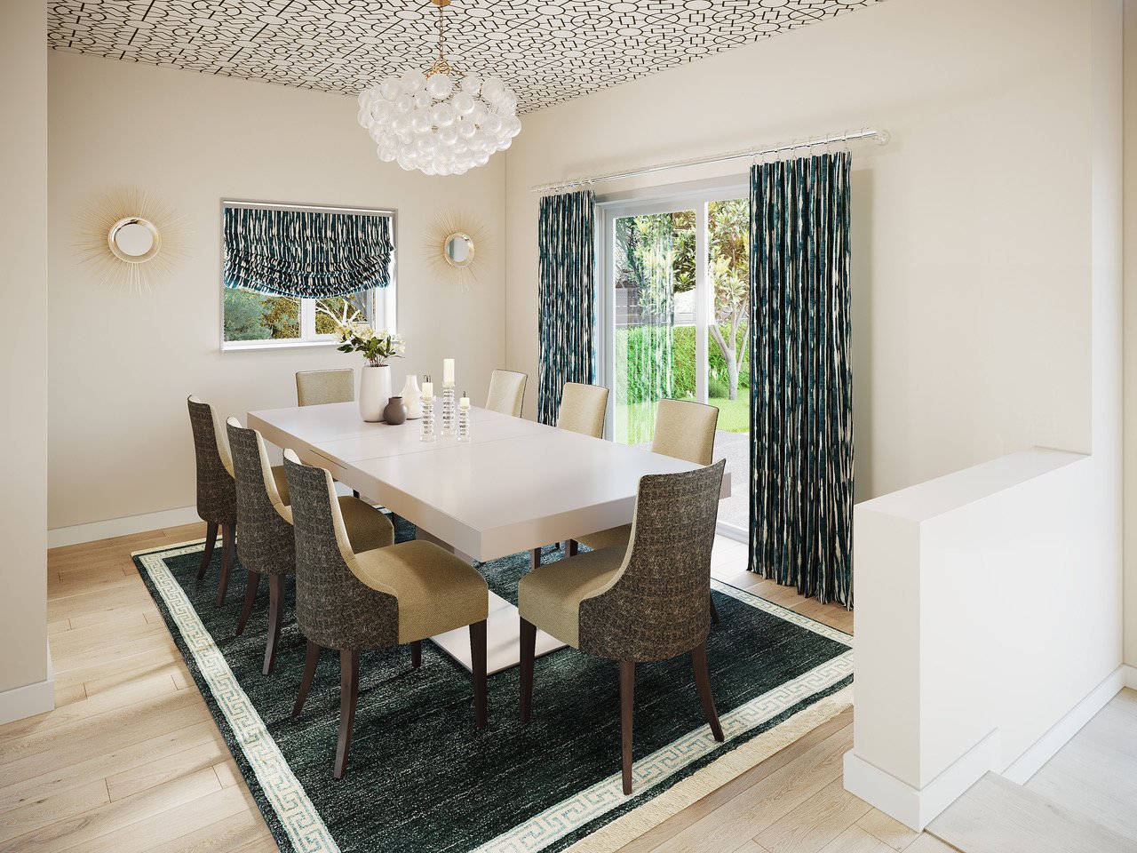
For many projects we will offer to have renderings made for our clients. This tool helps them to visualize the design so, they have a better understanding of the end result.
Completed Project Photos
Before & After Photos
The Powder Room
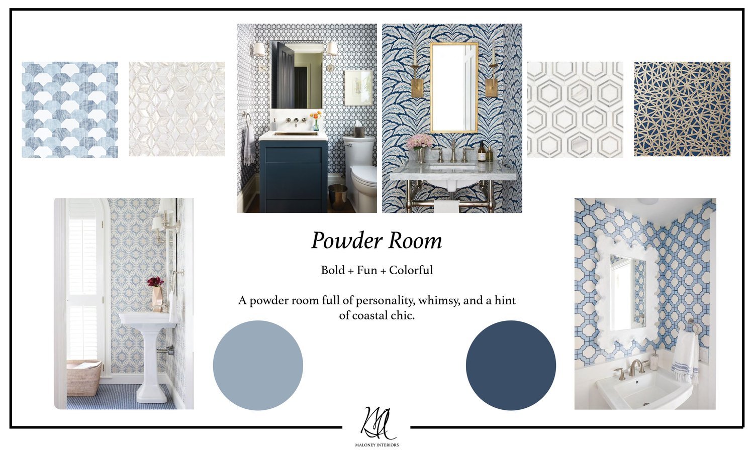
The powder room is the perfect place to be bold! Our clients wanted the space to be fun, whimsical and unexpected. We planned on wallpapering the entire bathroom in a blue print, something that would compliment nicely with the other dynamic patterns through out the design. The blue and white color palette introduces coastal colors while, still using urban chic motifs.
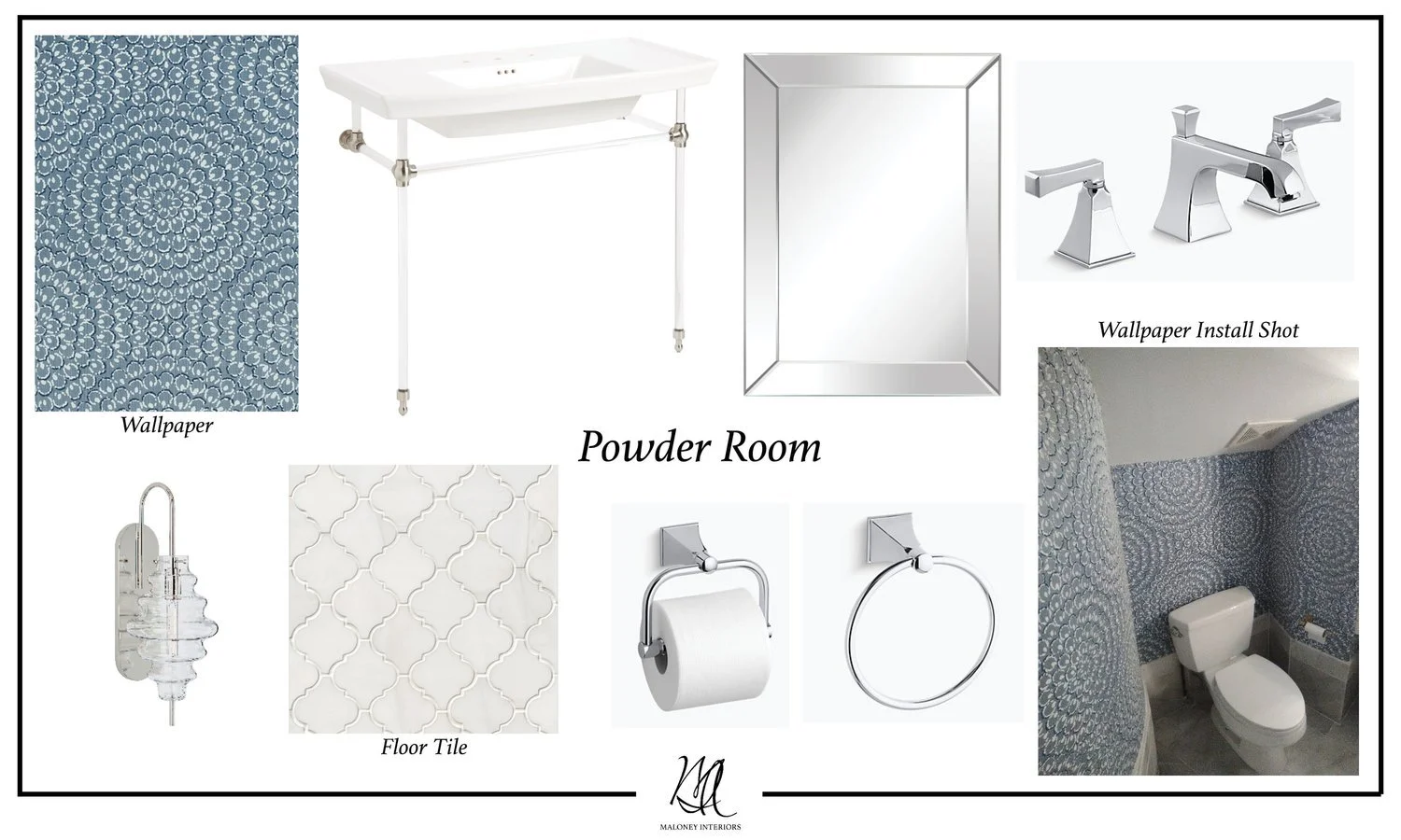
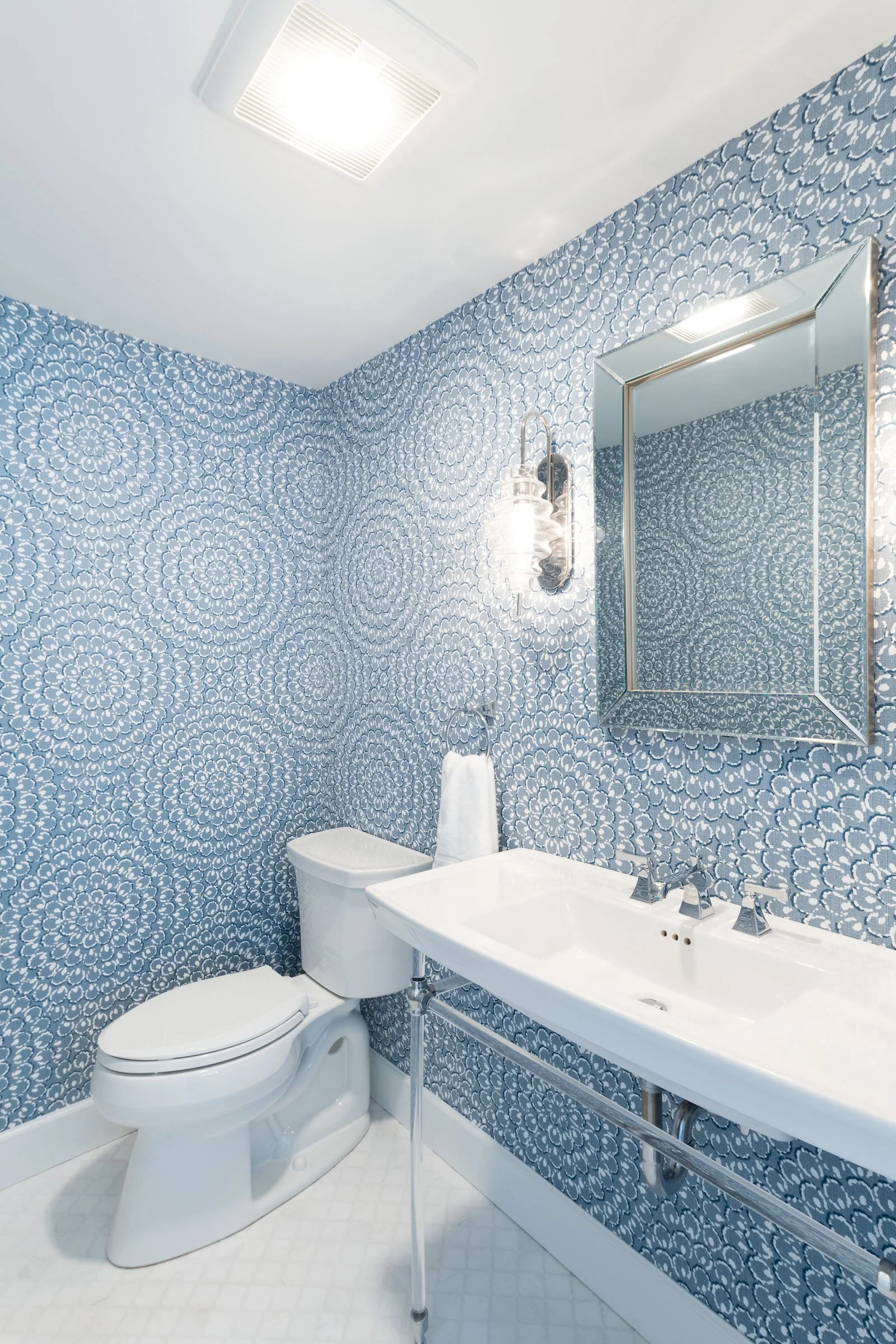
We knew we had to balance all the elements of the design very carefully, as we continued into the detailed design phase. Establishing a hierarchy with the materials will give the space a refined look. The Thibaut wallpaper is fun and abstract and the arabesque marble floor time adds level of elegance to the overall space.
Completed Project Photos
Before & After Photos
Guest Bedroom One
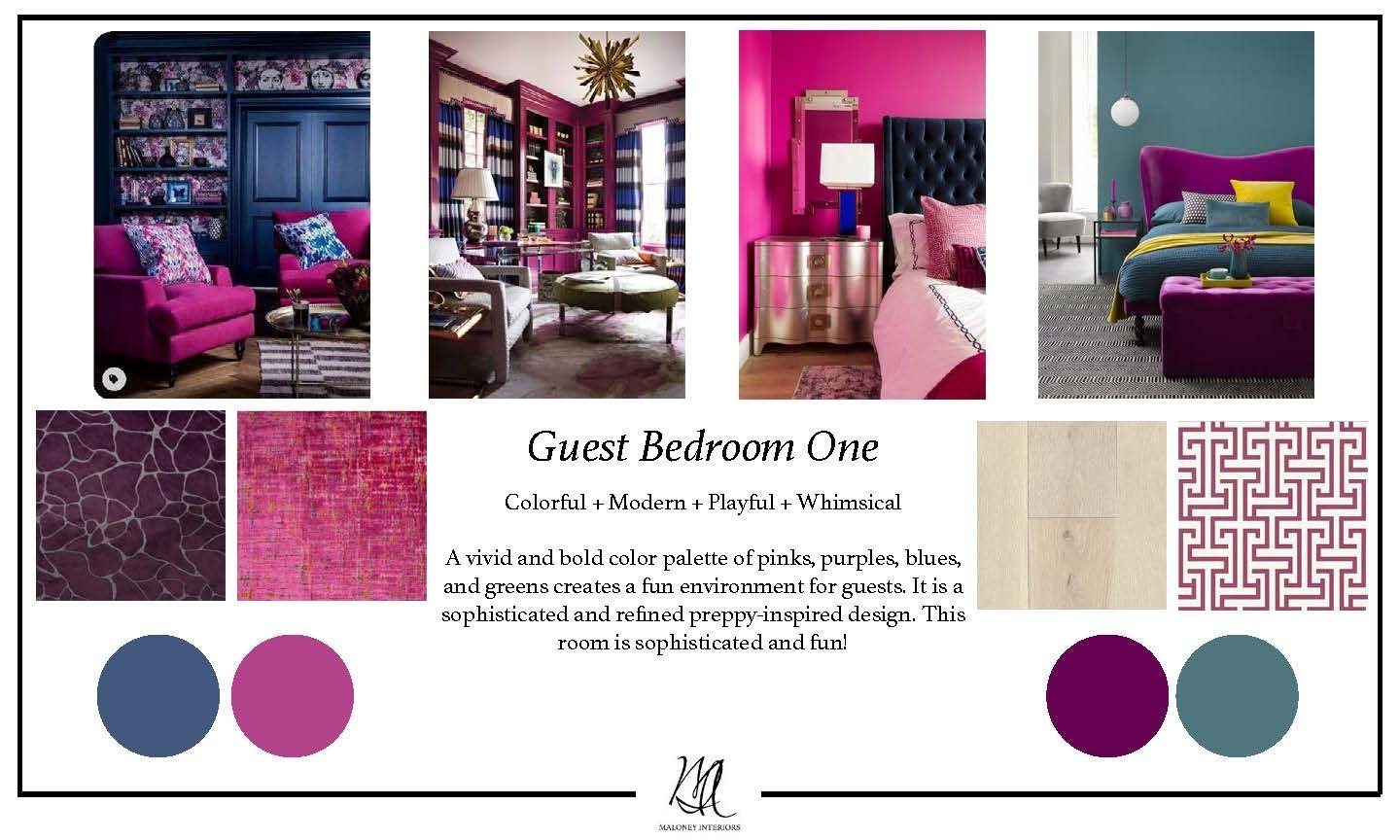
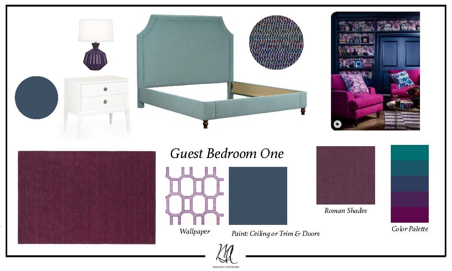
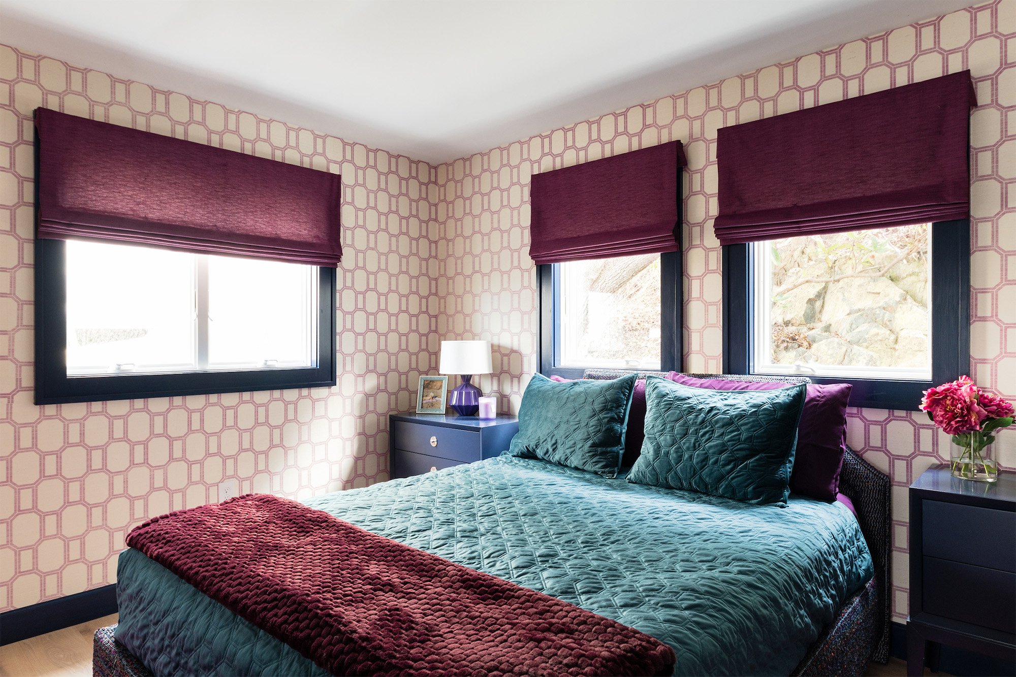
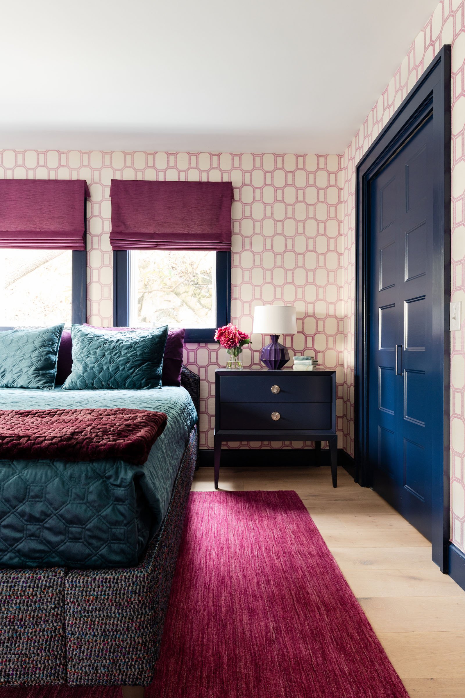
For the first guest bedroom we decided to go bold with the design. The color palette is similar to that of the living room with purples, navy, and greens however, we wanted to explore more patterns and prints. A bright geometric wallpaper and navy blue trim through out the room will create a playful and sophisticated environment. This room is all about layering, patterns, textures, and colors.
As we progressed into the detailed design phase we thought an upholstered headboard could be a fun element. We chose a multi colored textured weave from Romo which felt very youthful and helped to tie all the colors together. Often times in our projects we have to modify furniture pieces to fit the space. For example, the headboard had to be shortened in order to fit perfectly underneath the windows. Other design selections included, Philip Jeffries wallpaper, nightstands from Wildwood, and table lamps from Robert Abbey.
Completed Project Photos
Before & After Photos
Master Bedroom
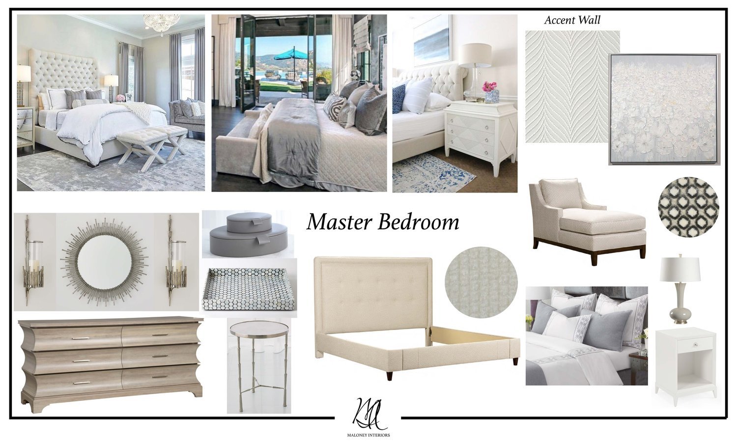
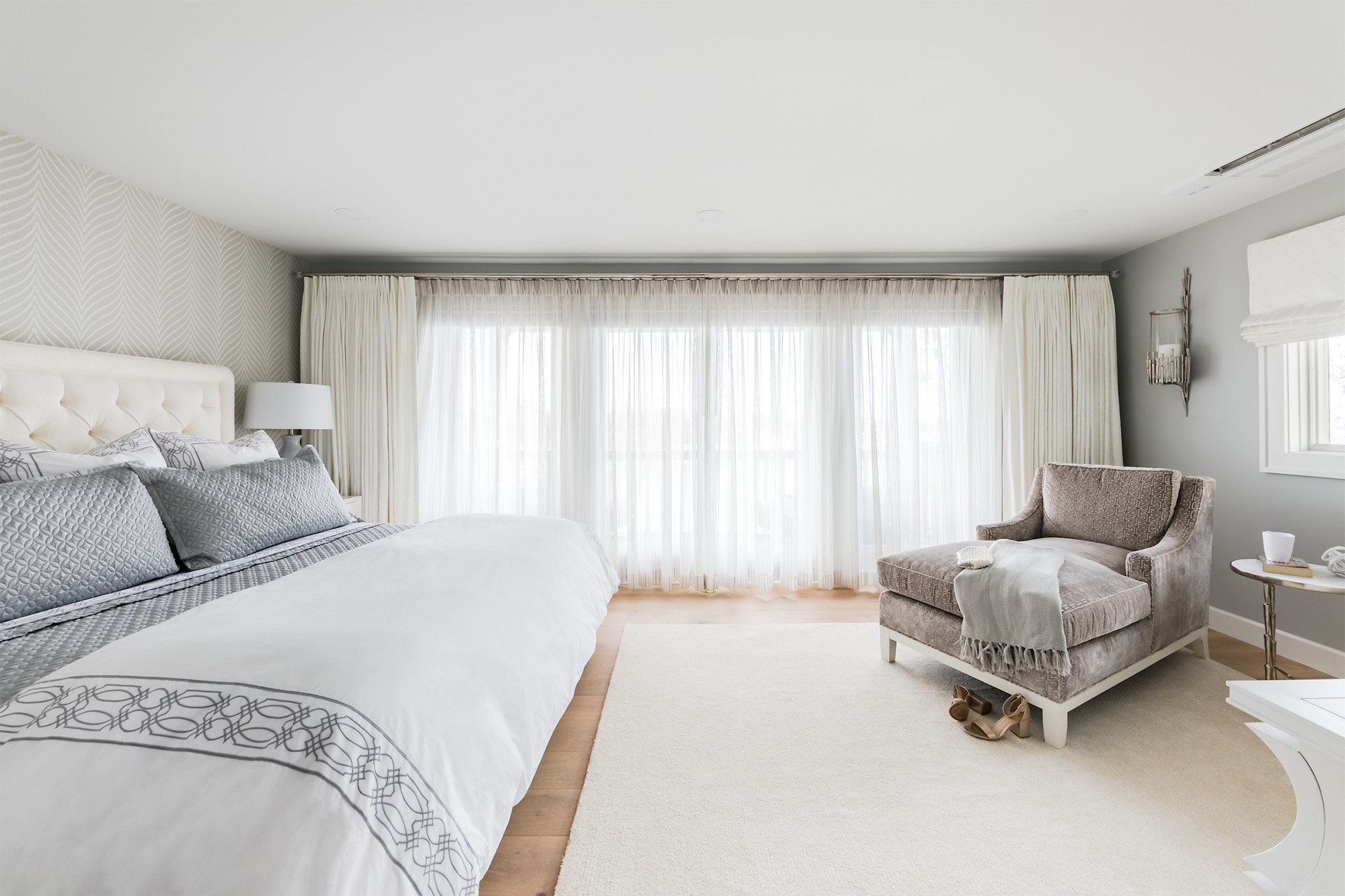
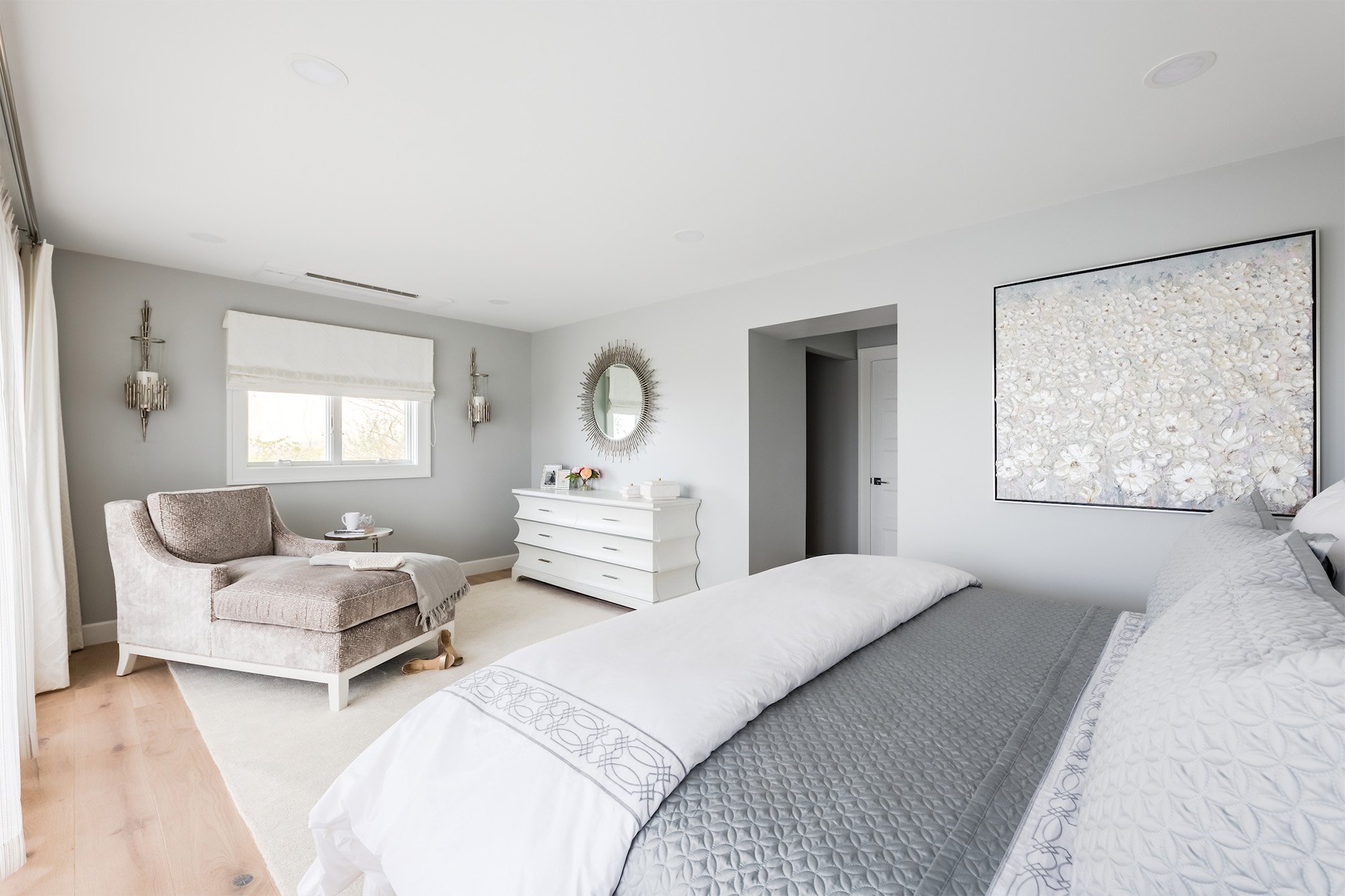
Our clients wanted the master bedroom to be a space where they can relax after a long day. The concept design reflected this request through the use of a minimal color palette and lush upholsteries. This space acts as a break from all the other colorful areas of the home. The waterfront view stands out even more because of the simple design, which only adds to the calming and airy atmosphere.
The design became a glamorous oasis with delicate patterns and metallic accents. The wall behind the king bed was decorated with a light gray Thibaut wallpaper to create a focal wall. We included a chaise, perfect for lounging, reading a book, or enjoying the waterfront views.
Completed Project Photos
Before & After Photos
Master Bathroom
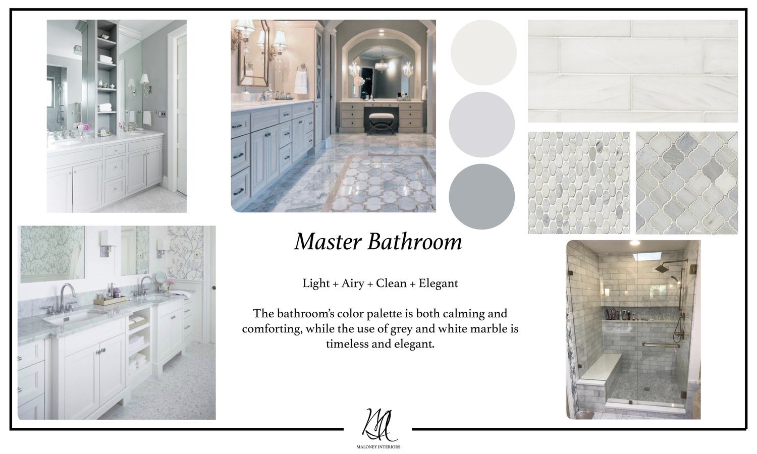
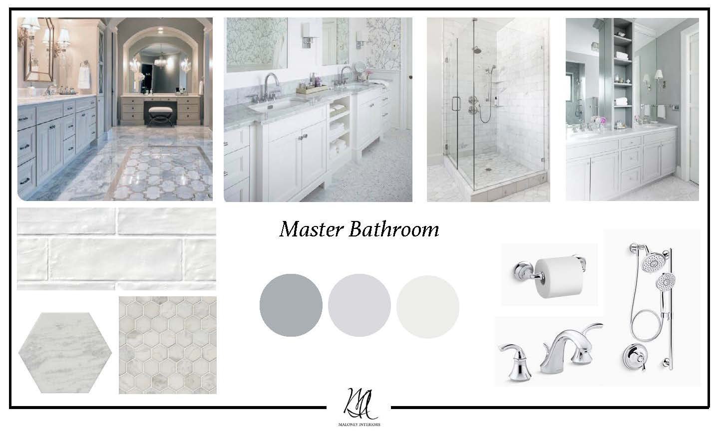
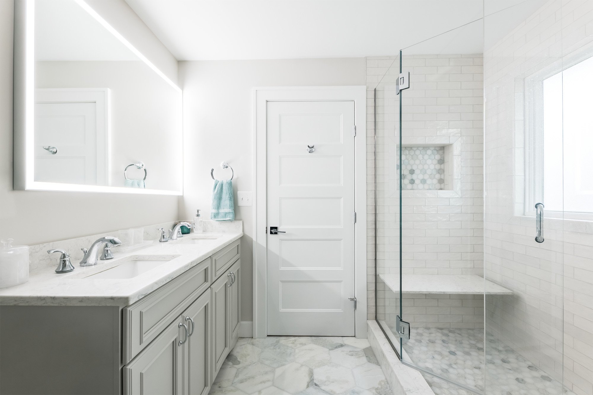
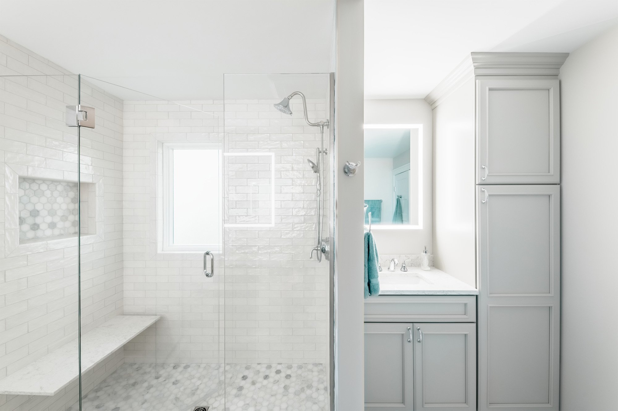
The master bathroom follows a similar concept as the master bedroom. The space is meant to feel airy, light, and elegant through the use of stone and tile. The bathroom originally was only connected to the master bedroom however, we decided to redesign the layout so the guest bedroom had access as well. It developed into a jack and jill style bathroom with a double vanity for the master and a single vanity for the guest.
When sourcing the tile we discovered a subway tile with a textured pearlescent finish. We planned to use this unique tile on the shower walls and a 2” hexagon tile for the floor. We also selected a 12” Africa Tempesta hexagon tile for the main bathroom floor. The marble added an elegance to the space while, the geometric shape added a modern feel.
Completed Project Photos
Before & After Photos
Guest Bedroom Two
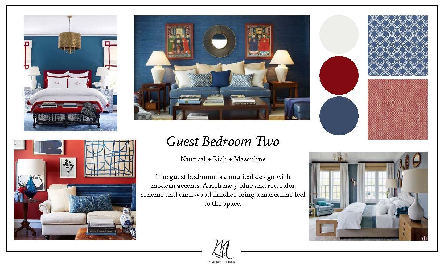
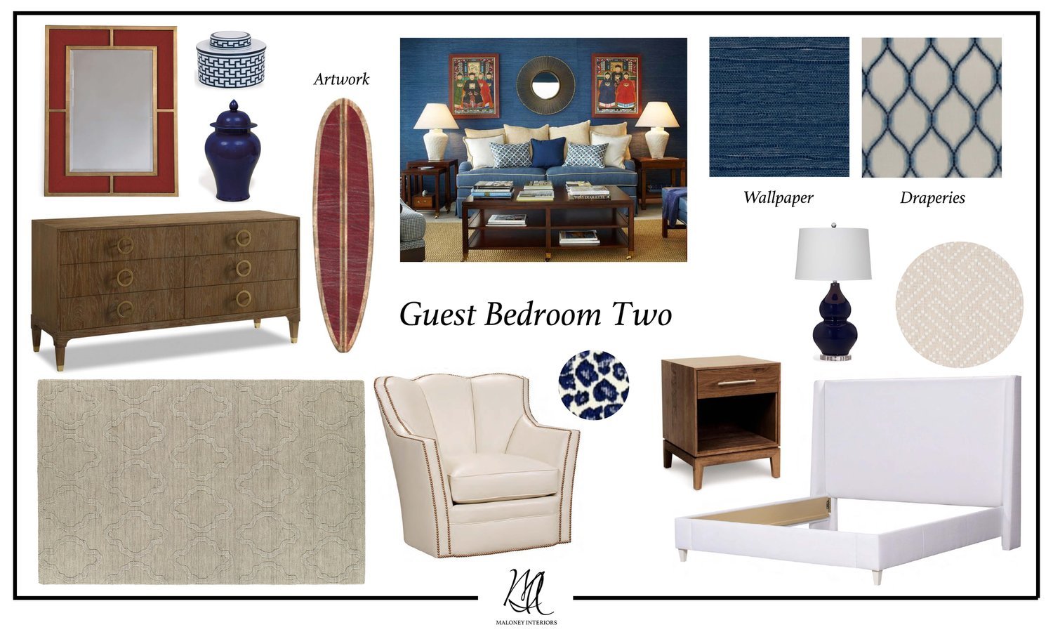
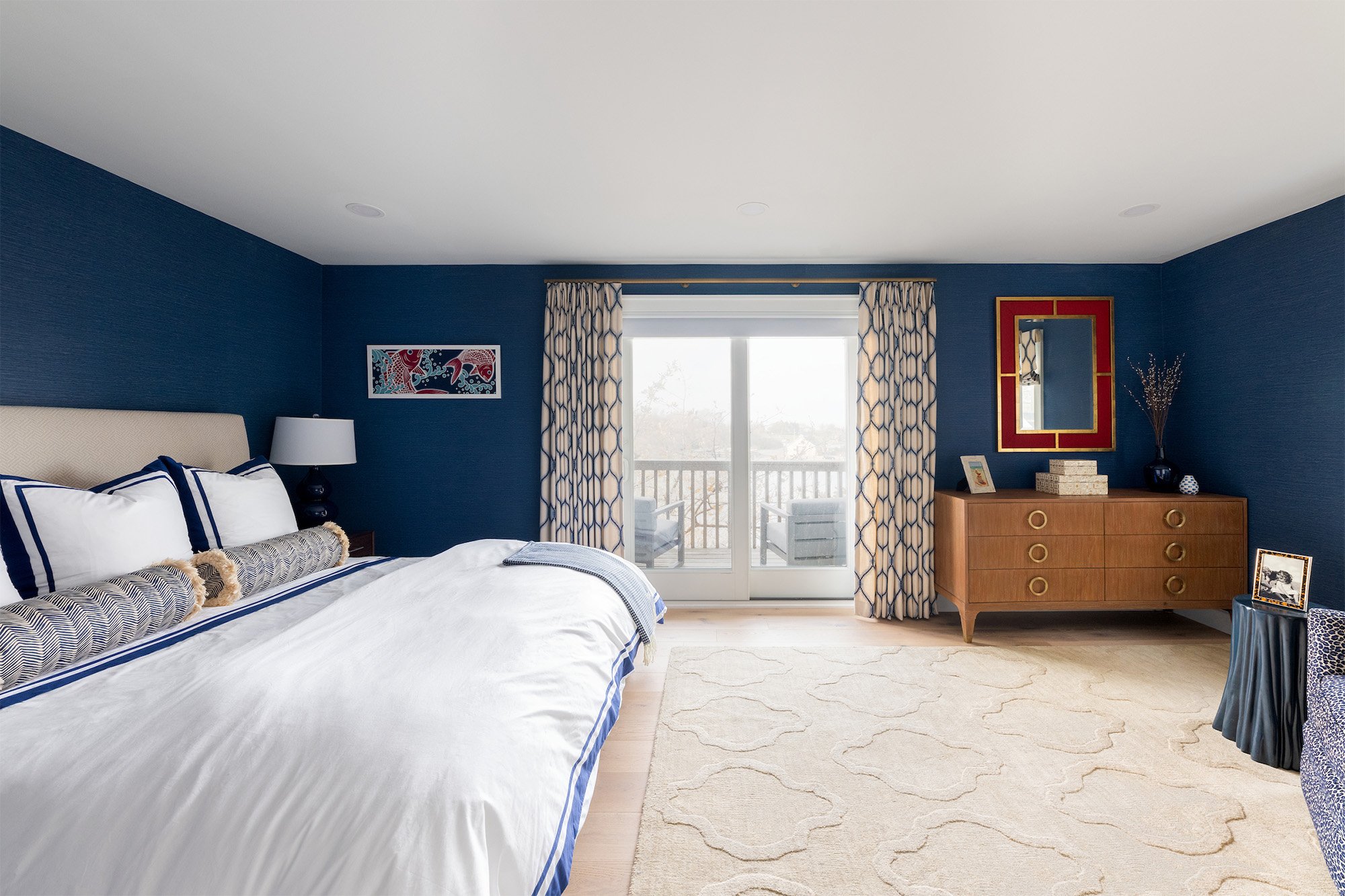
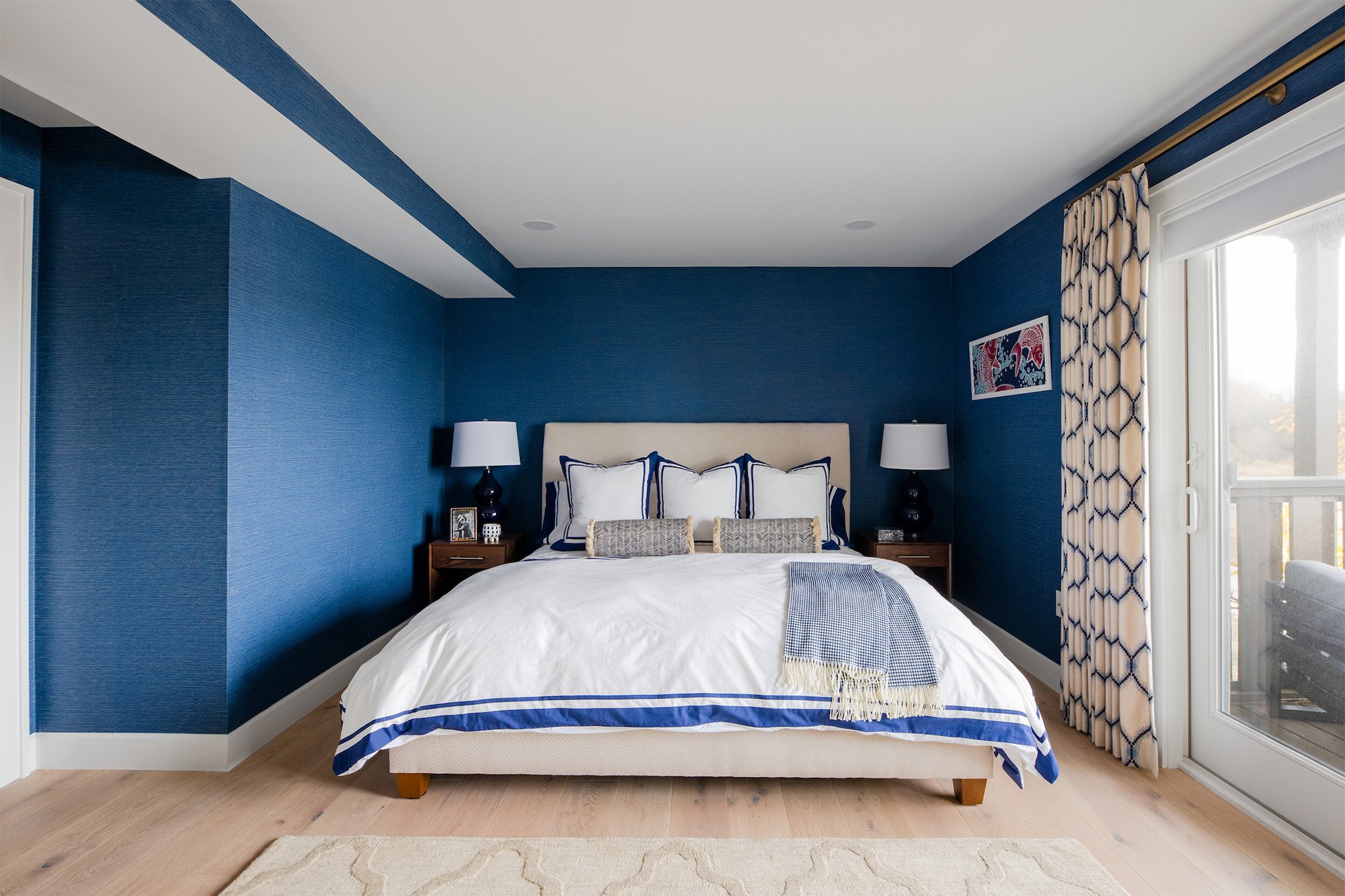
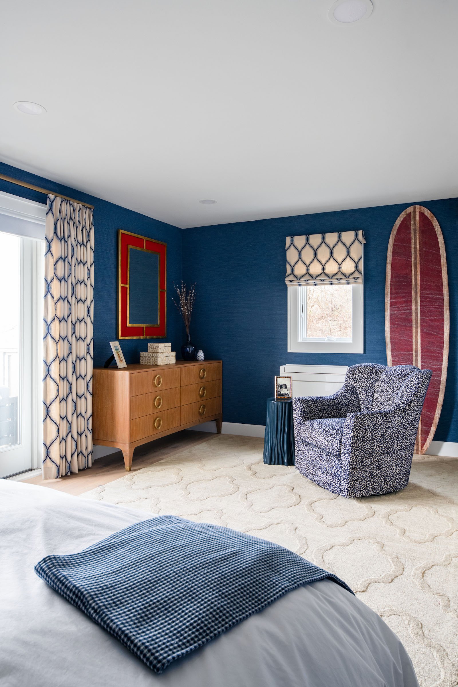
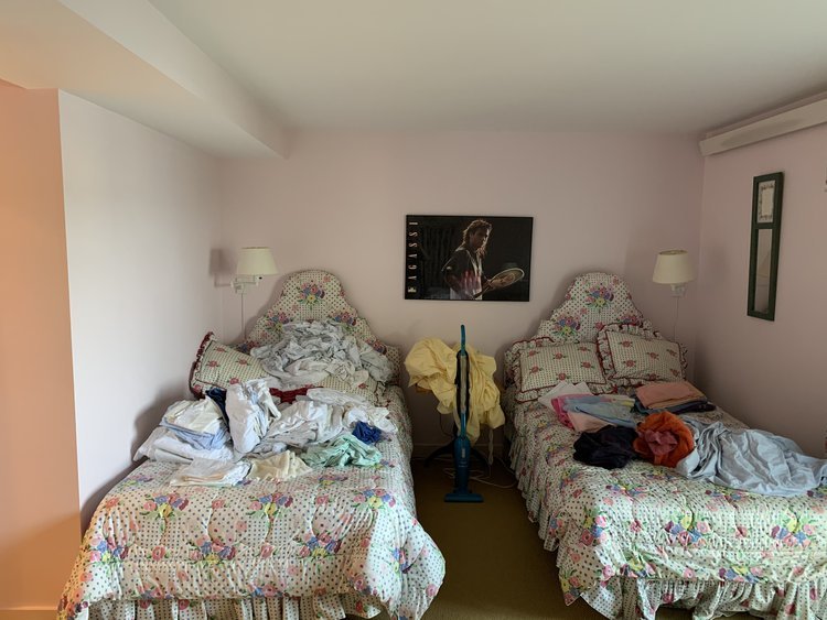
For the second guest bedroom we decided to do something a little different. Since, the home is located in Newport we wanted one space to really encompass a nautical style. The rich blue, red and gold palette will achieve the nautical look while, the case goods will add a modern twist. This room is a perfect example of transforming a traditional style into a current design.
As we continued into the detailed design phase we knew we wanted to make a bold statement by using a navy blue Thibaut wallpaper on all four walls for the room. This created a bold contrast against the red & gold mirror from Port 68 and the faux surfboard from Wendover Art Group. Keeping in mind the client’s appreciation of modern design, we selected the Atherton Teak Dresser from Brownstone Furniture. When selecting fabrics we chose motifs that felt both modern and traditional. The armchair’s navy blue leopard print upholstery adds a youthful and chic feel to the design.
Completed Project Photos
Before & After Photos
Guest Bathroom
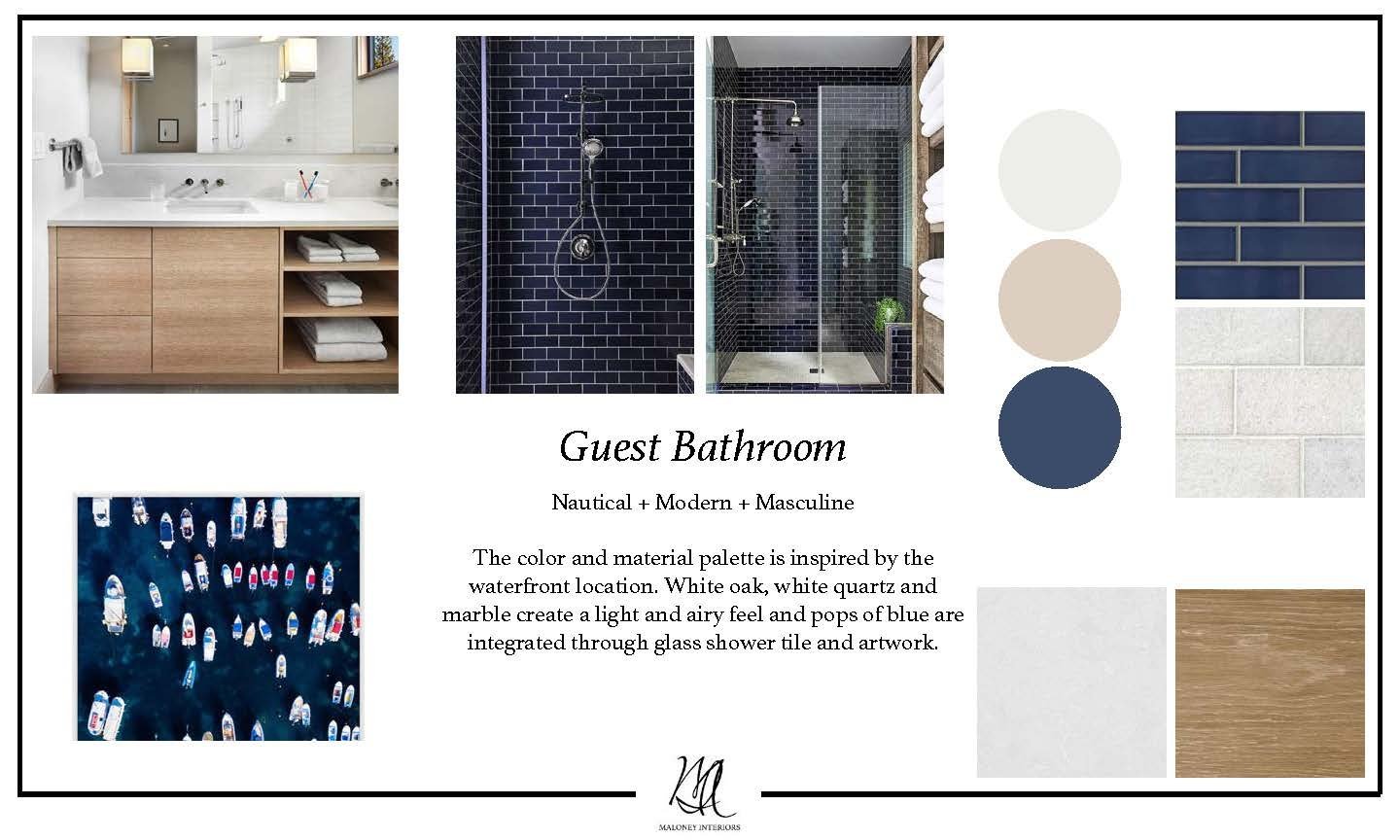
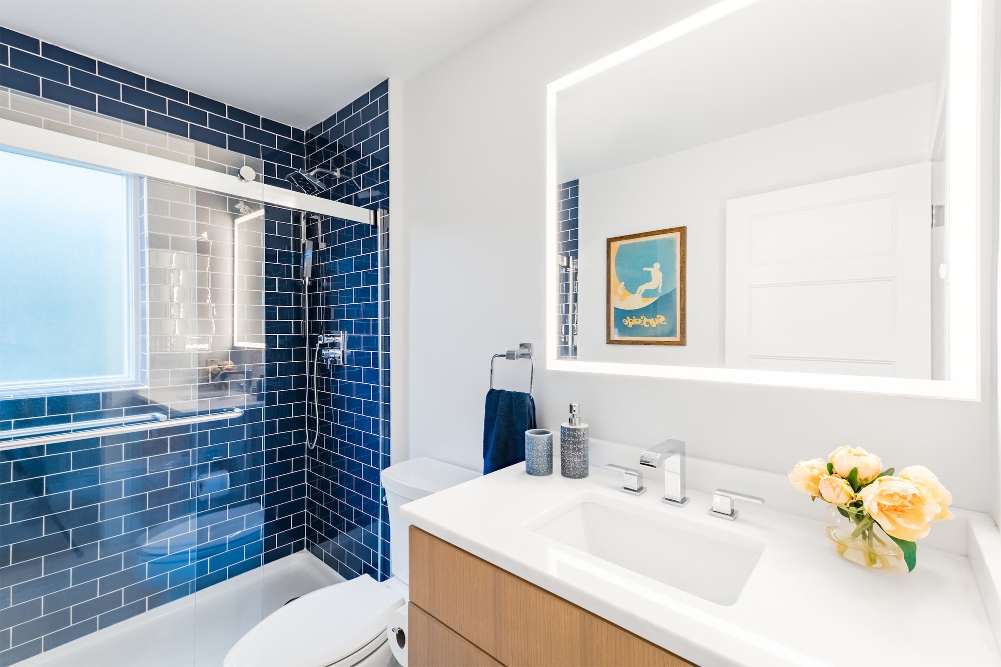
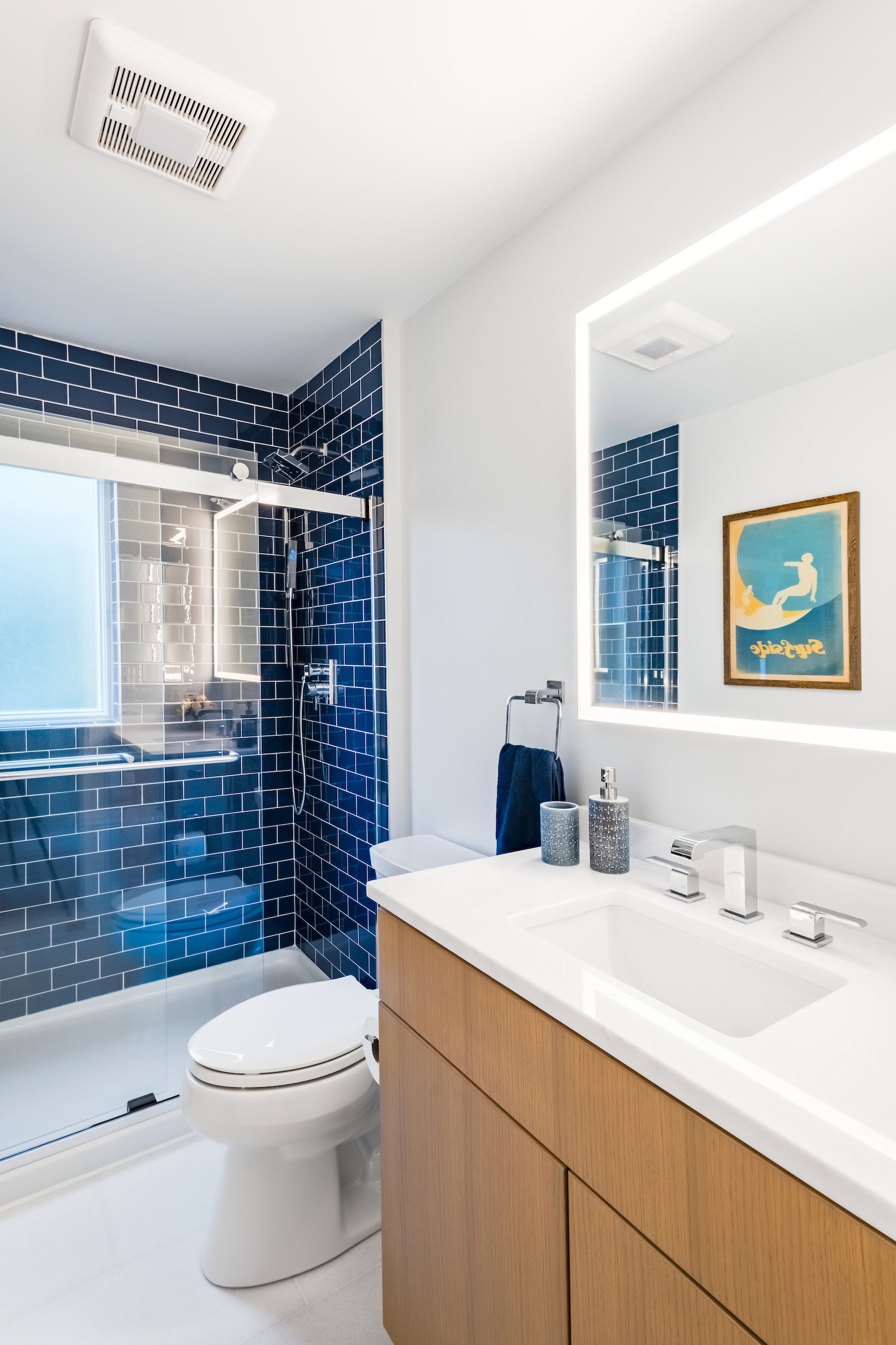
The concept for the guest bathroom was to create a nautical modern design, similar to the guest bedroom. We wanted this bathroom to feel more masculine which we achieved by using simple and sleek finishes, while the navy blue glass tile brings a nautical touch.
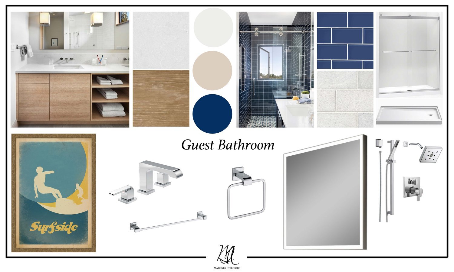
During the detailed design phase we selected polished chrome hardware, navy blue glass tile, and a lit mirror. These items made the space feel masculine because of the simplistic details. Adding a vintage surfer print from Wendover Art Group brings some warmth to the space while, introducing an element of fun!

